
W.S Cowell: A small firm with big ideas
S. H. Cowell was established in 1818 as a printers and stationers in Ipswich’s Butter Market, continuing the town’s long history of printing that dates back to the 1500s.
The firm, more commonly known as Cowells, was started by Abraham Kersey Cowell for his son, Samuel Harrison, after seeing a market for printing religious leaflets and hymn books. With a side-line in selling tea, coffee, wines and stationery, the printers grew quickly and by the mid-1800s had developed a national reputation as a printer.
W.S. Cowell, alongside three other British printers, secured a licence to use the German Anastatic printing process. This method allowed W.S. Cowell to work closely with artists who supplied original artwork on special transfer paper. This started the company's relationship of working directly with artists.
W.S. Cowell were clever with their marketing and sponsored the national Anastatic Drawing Society to build their relationship with artists who were members.

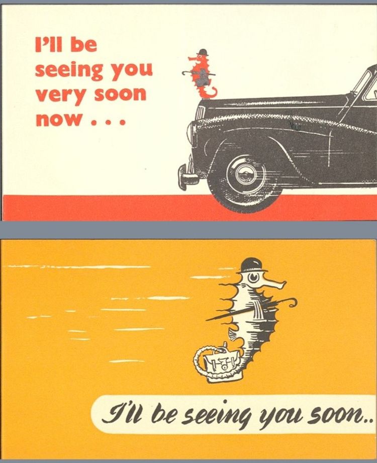
W.S. Cowell and... Seahorses?
Seahorses can often be spotted in waters off the suffolk coast, an account of fisherman off the mouth of the river Orwell in Ipswich once caught over a hundred seahorses on one day. The historic emblem of Ipswich features two half horse, half fish creatures either side of the crest.
W.S. Cowell were inspired by this to adopt a seahorse as their emblem. Throughout their work the seahorse is used as an emblem, often redrawn again and again by many different artists.

The Printworks

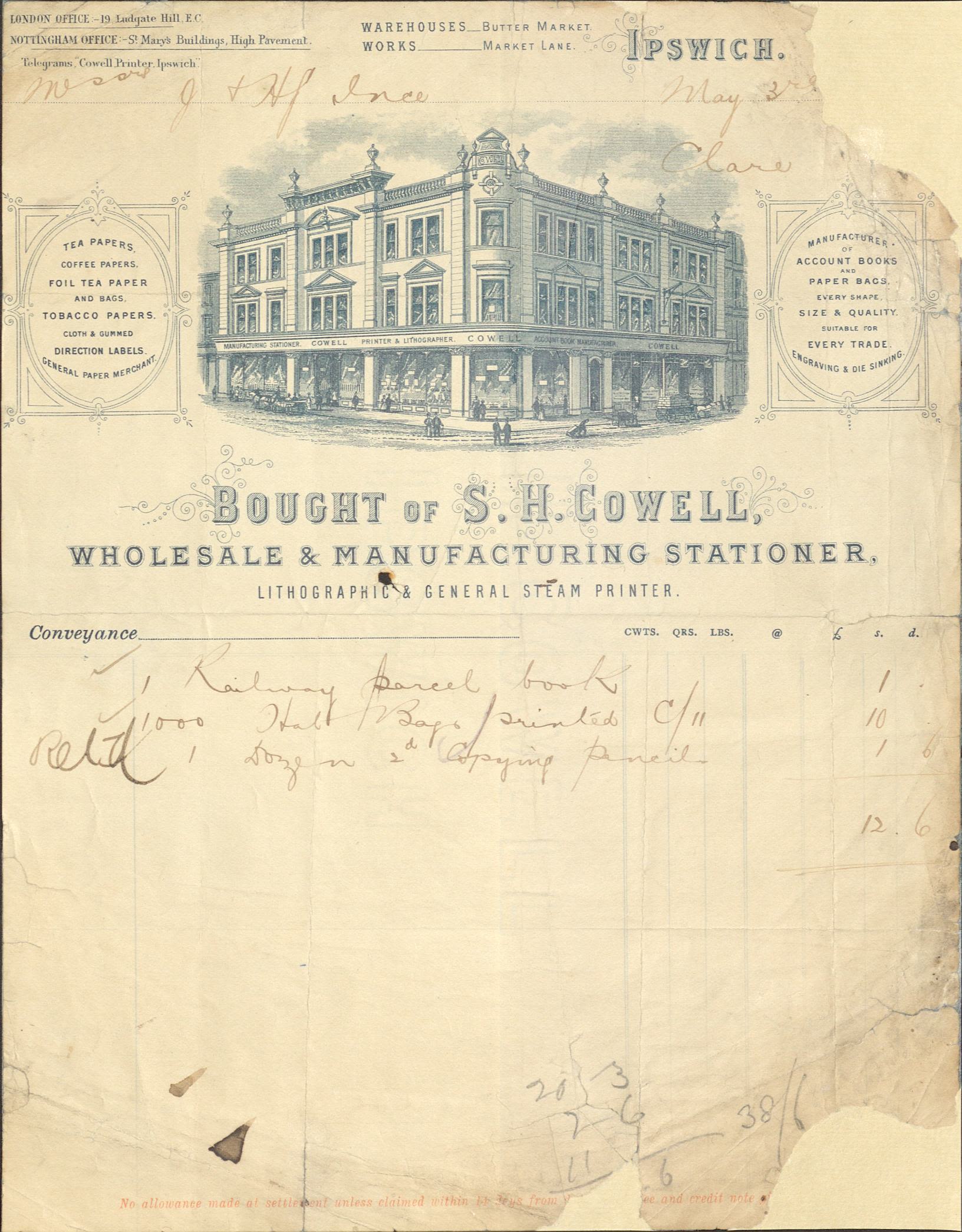
Receipt from W.S. Cowell for a purchase in 1883 (HC439/A/E/3/9).
Receipt from W.S. Cowell for a purchase in 1883 (HC439/A/E/3/9).
S. H. Cowell was established in 1818 as a printers and stationers in Ipswich’s Butter Market, continuing the town’s long history of printing that dates back to the 1500s.
A growing Company....
The firm, more commonly known as Cowells, was started by Abraham Kersey Cowell for his son, Samuel Harrison, after seeing a market for printing religious leaflets and hymn books. With a side-line in selling tea, coffee, wines and stationery, the printers grew quickly and by the mid-1800s had developed a national reputation as a printer.
Examples of some of the things Cowell's printed are below.

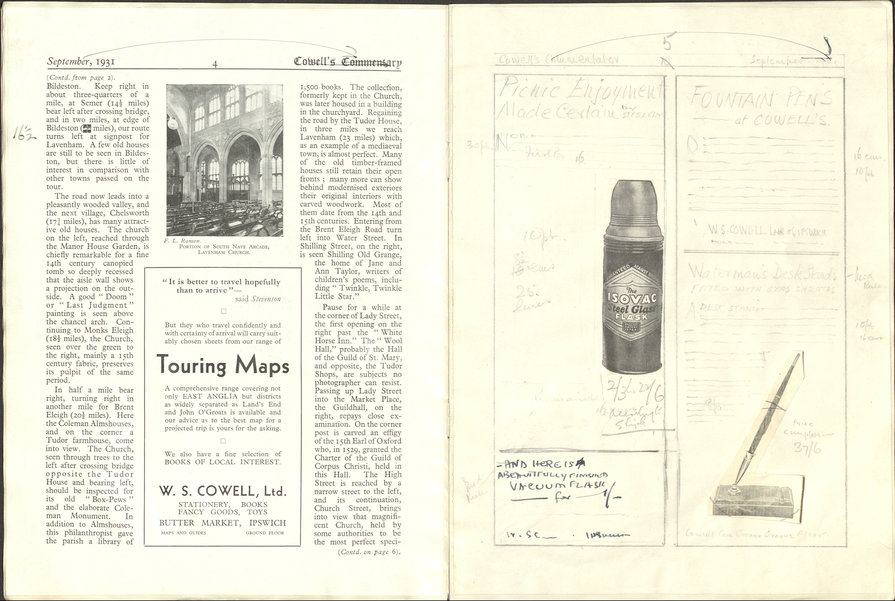
A draft layout of a page of "Cowell's Commentary", which was the company's in house journal, (HC439/A/A/5/2/4).
A draft layout of a page of "Cowell's Commentary", which was the company's in house journal, (HC439/A/A/5/2/4).
A flick-through of the humorous "History of Fabric" by Horrockses, famous cotton manufacturer (HD2272/324/100).
A flick-through of the humorous "History of Fabric" by Horrockses, famous cotton manufacturer (HD2272/324/100).

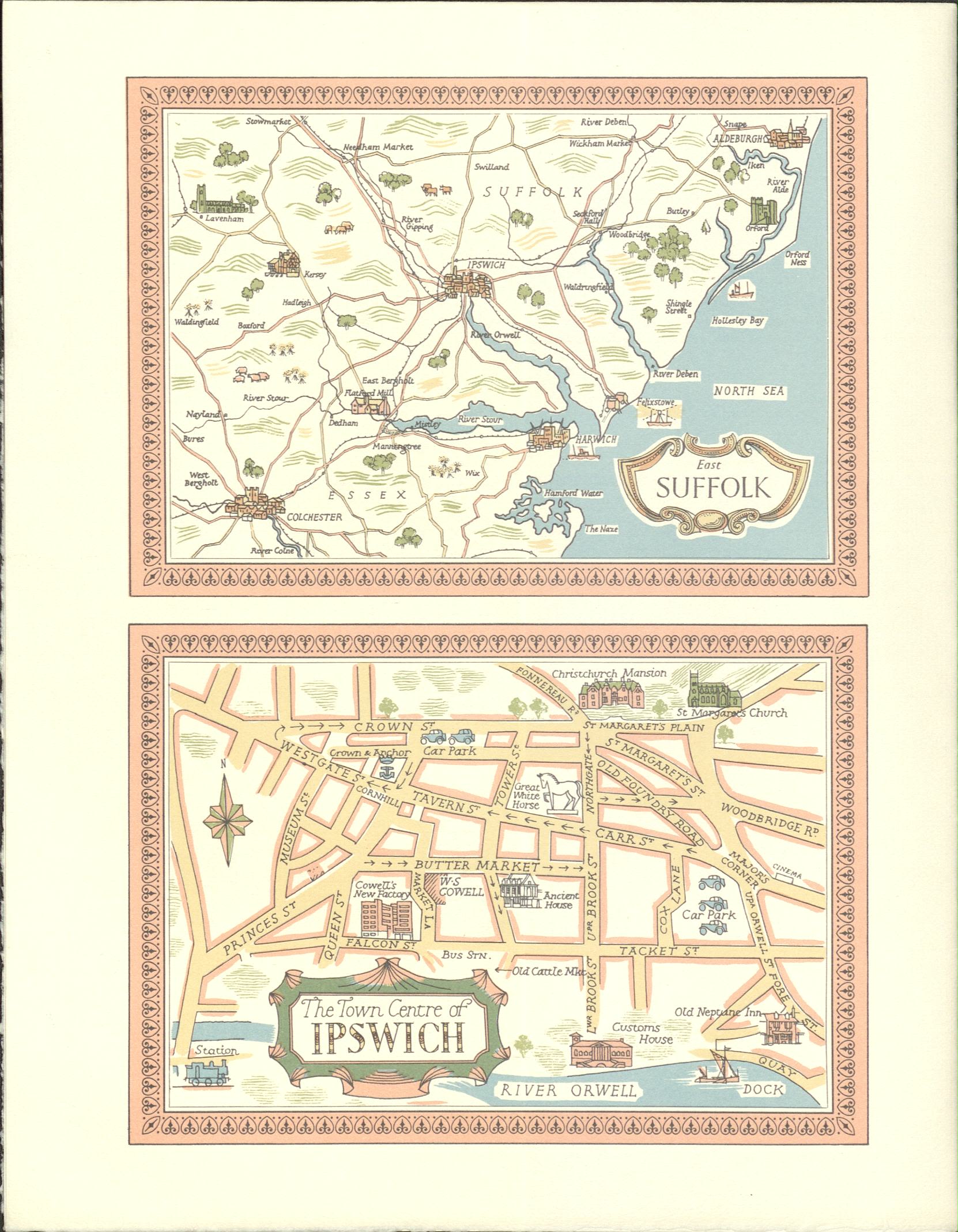
Maps of Suffolk and Ipswich printed on the reverse of an invitation to a lunch hosted by W.S. Cowell for their customers. (HC439/A/E/4/16).
Maps of Suffolk and Ipswich printed on the reverse of an invitation to a lunch hosted by W.S. Cowell for their customers. (HC439/A/E/4/16).

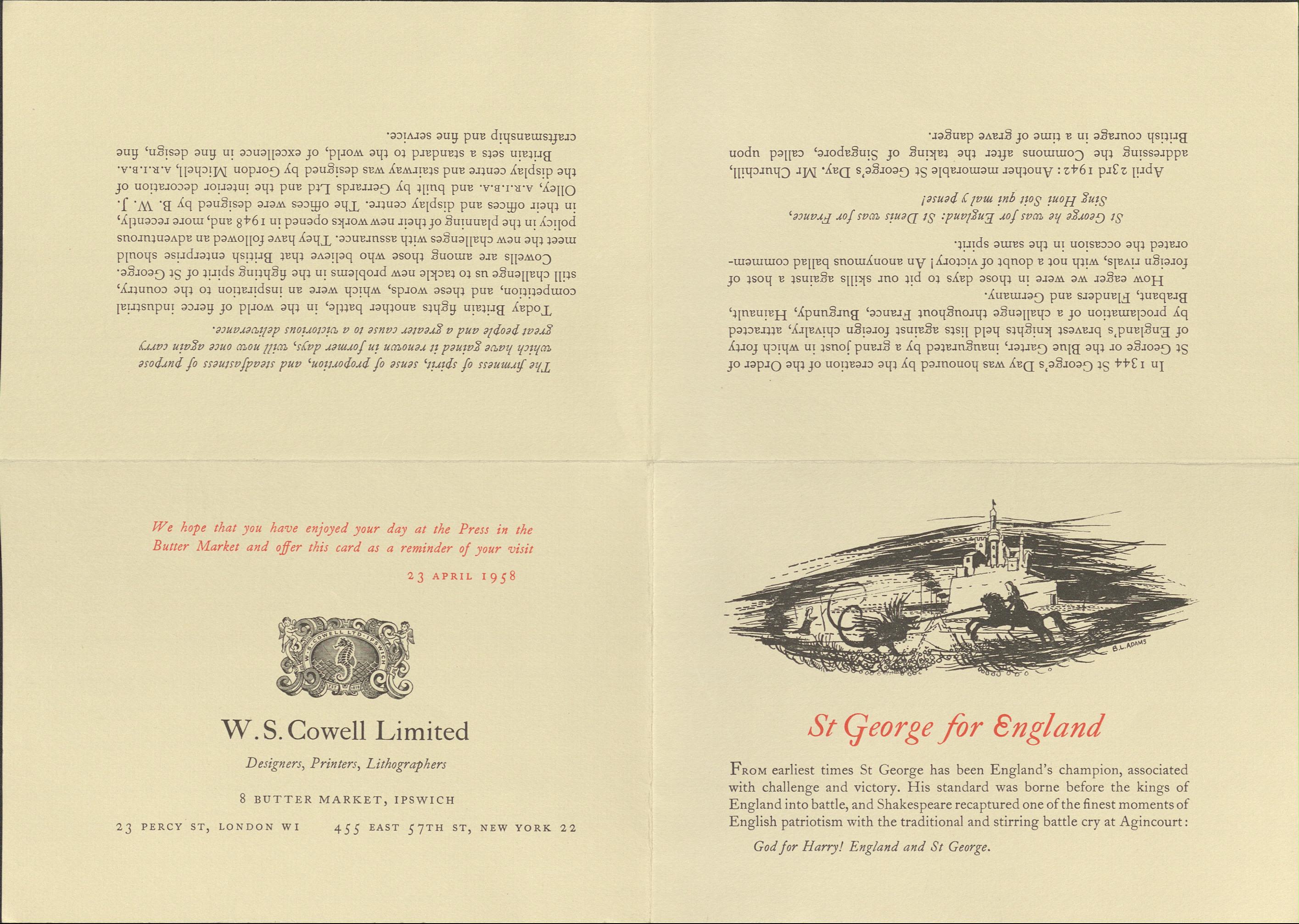
A folded card which was printed to mark St George's Day, (HC439/A/E/4/16).
A folded card which was printed to mark St George's Day, (HC439/A/E/4/16).
Inside the print works
The archive collection gives us a glimpse into what the paintwork looked like, throughout the 150's years of W.S Cowell.
Published in 1888, "A Walk Through Our Works", (HC439/A/A/5/2/2), gives us a glimpse into what the printworks was like at the time.
Published in 1888, "A Walk Through Our Works", (HC439/A/A/5/2/2), gives us a glimpse into what the printworks was like at the time.
Published in 1959, “The Press in the Buttermarket, A Camera Study by Geoffrey Ireland”, explores the printworks through a series of photos during the 150 years of W.S Cowell's existence.
Published in 1959, “The Press in the Buttermarket, A Camera Study by Geoffrey Ireland”, explores the printworks through a series of photos during the 150 years of W.S Cowell's existence.

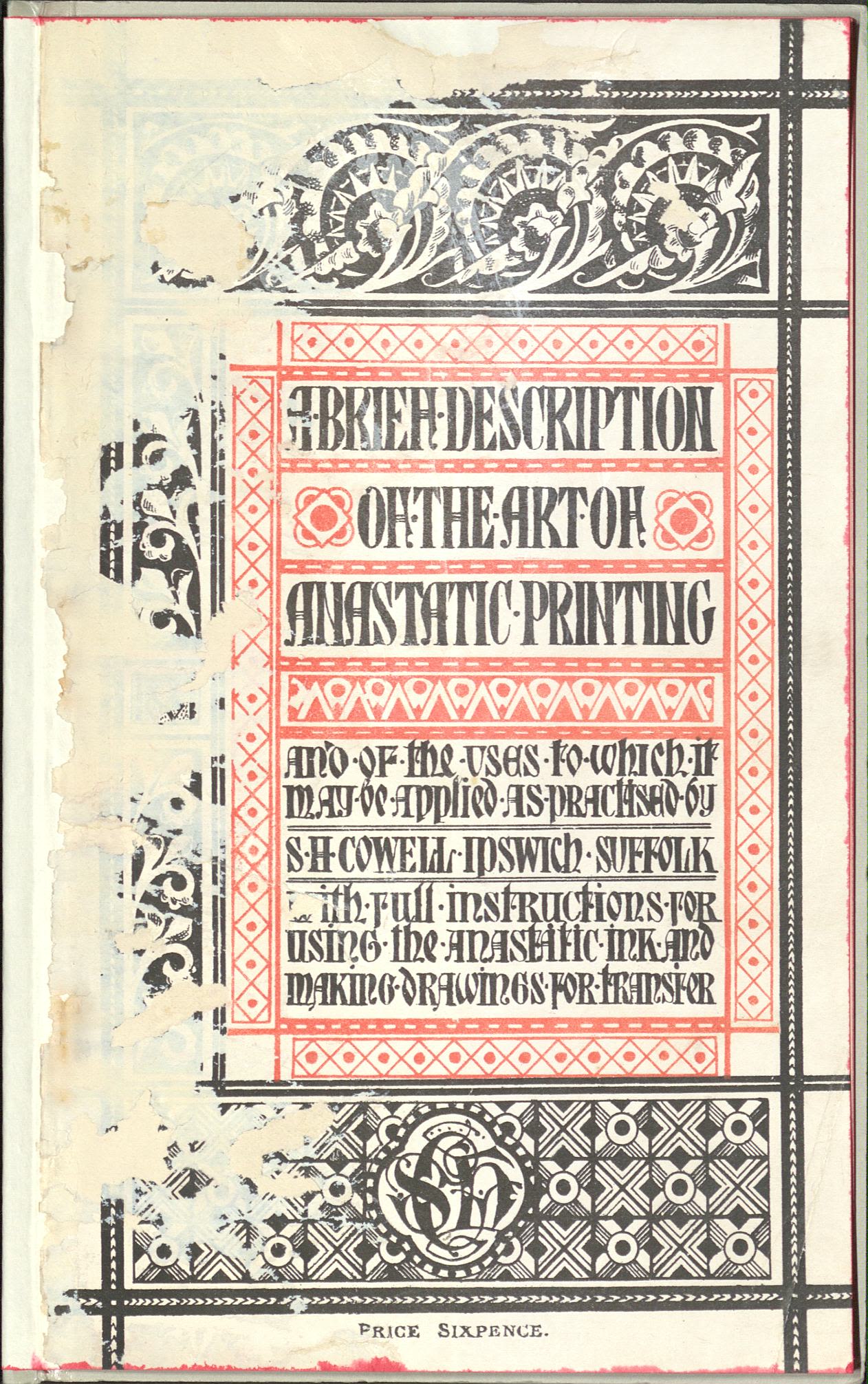
"A Brief Description of the Art of Anastatic Printing", by W.H. Cowell, (HC439/A/A/5/2/1).
"A Brief Description of the Art of Anastatic Printing", by W.H. Cowell, (HC439/A/A/5/2/1).
Anastatic Printing
W.S. Cowell, alongside three other British printers, secured a licence to use the German Anastatic printing process. This method allowed W.S. Cowell to work closely with artists who supplied original artwork on special transfer paper. This started the companies relationship of working directly with artists.
W.S. Cowell were clever with their marketing and sponsored the national Anastatic Drawing Society to build their relationship with artists who were members.
Examples of a book detailing this process and a couple of drawing are shown to the left and below, respectively.

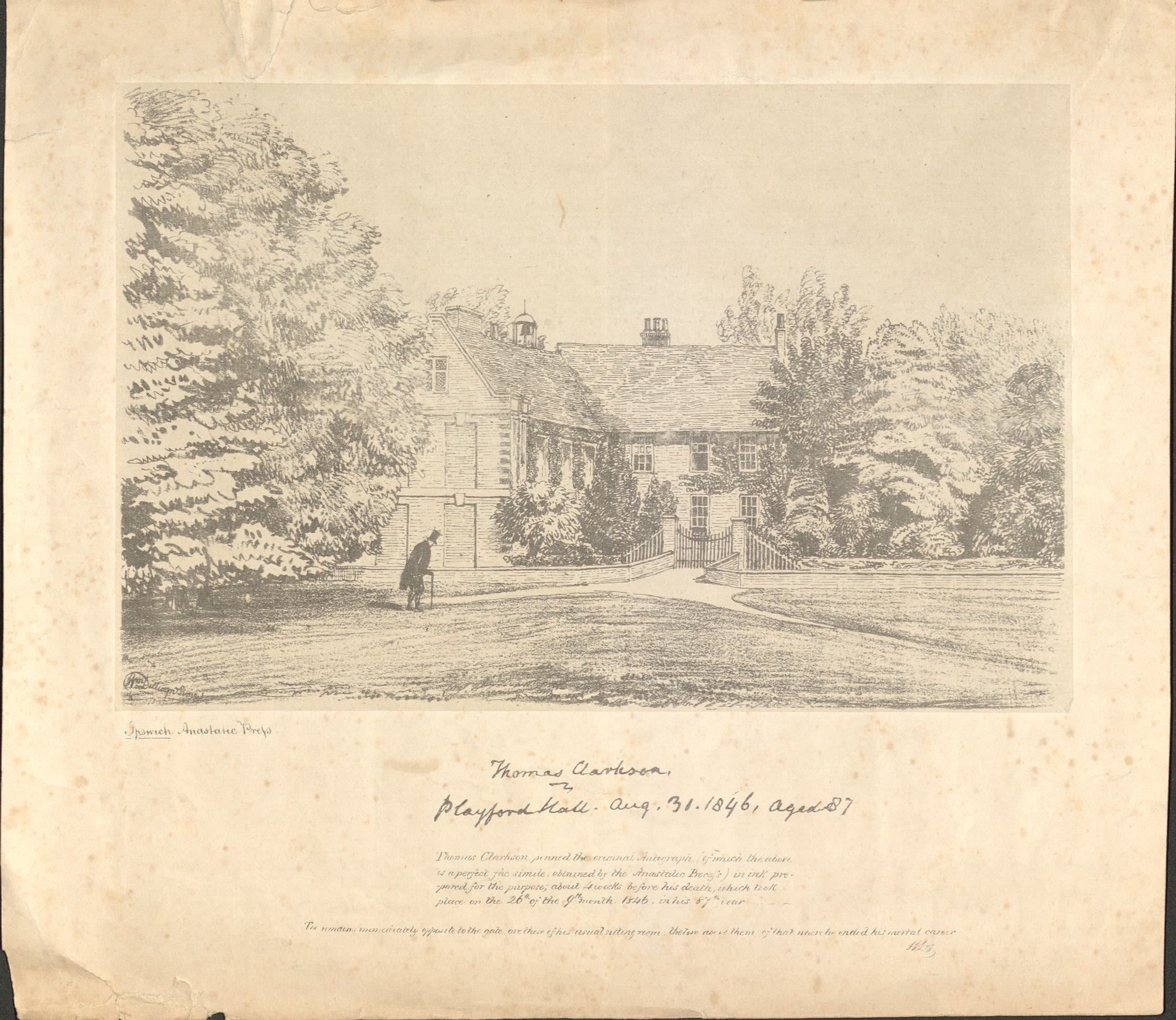
An example of anastatic printing: a line drawing of Playford Hall in Suffolk, the home of abolitionist Thomas Clarkson (HC439/A/E/4/10).
An example of anastatic printing: a line drawing of Playford Hall in Suffolk, the home of abolitionist Thomas Clarkson (HC439/A/E/4/10).

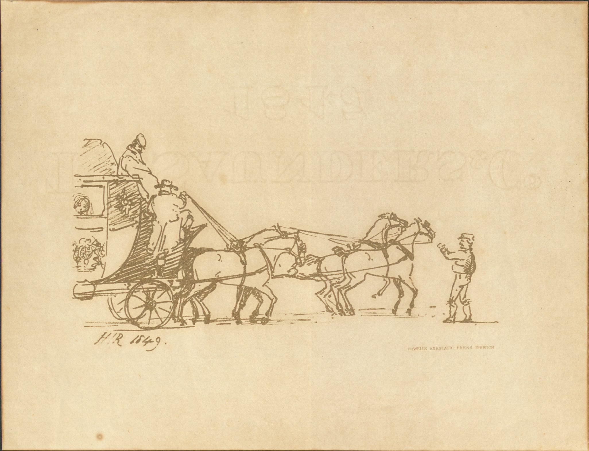
An example of anastatic printing: a line drawing of a coach and horses (HC439/B/E/4/1).
An example of anastatic printing: a line drawing of a coach and horses (HC439/B/E/4/1).
Cine film footage of the Lithography team at W.S Cowells in the 1960s. Courtesy of John Ling. This footage has no sound.
Cine film footage of the Lithography team at W.S Cowells in the 1960s. Courtesy of John Ling. This footage has no sound.
New Characters
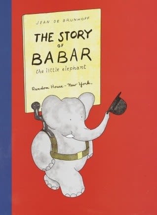
Babar the Elephant
In 1934, W. S. Cowell was one of only a small number of printers in Britain who were capable of printing Jean de Brunhoff’s The Story of Babar, the Little Elephant to the same high quality of the original French edition.
As a result W.S. Cowell were awarded the job of producing the first UK editions. This was the start of a new generation of picture book makers, and left W.S. Cowell as a company ‘bitten by the bug of printing books’.

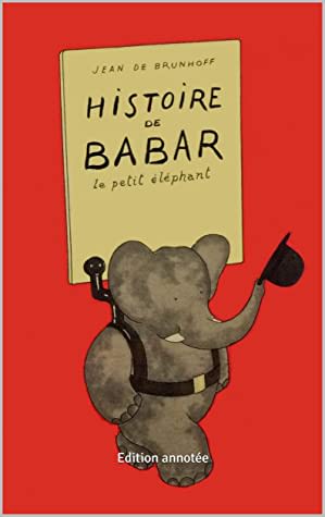
"Histoire de Babar le Petit Éléphant". Jean de Brunhoff. 1931.
"Histoire de Babar le Petit Éléphant". Jean de Brunhoff. 1931.

"The Story of Babar the Little Elephant". Translated into English. Jean de Brunhoff. 1934.
"The Story of Babar the Little Elephant". Translated into English. Jean de Brunhoff. 1934.
Re-evaluating Babar the Elephant
It is important to take time to understand assessment and critique of the story of Babar the Elephant as promoting colonialism and looking back on a colonial era as nostalgic.
The story of the book covers colonial and racist themes such as ‘civilising’ the elephants by leaving their home and visiting the city, being taught to follow white European customs and fashions, and taking this back to their own community to ‘improve’ their lives. Much of this aligns closely with European colonial beliefs and actions throughout history which (to make an understatement) had hugely harmful consequences and long-lasting impacts which many are still living with today.
Some early editions of books in the series contain racist, derogatory depictions of Black Indigenous, African communities and individuals.
Therefore it is important that we challenge our understanding and perception of this story and how we may present it, and discuss it to identify and breakdown the racist, white supremacist messaging and depictions within the story.
We need to take learning and awareness such as this and apply to further re-evaluation throughout collections both historic and contemporary.
Orlando The Marmalade Cat
Kathleen Hale was inspired by earlier children’s books and began writing and drawing her own stories featuring a marmalade-coloured cat called Orlando.
Kathleen Hale got in touch with the publisher and editor Noel Carrington about her work. Carrington was enthusiastic about the books but could see that the colour printing for the artwork would make it expensive. Geoffrey Smith from W.S. Cowell persuaded him that costs could be lowered by reducing the colours to just red, yellow, blue, and black. The price of printing would be further reduced by each colour being drawn directly on to the printing plate by the artist herself.
In this clip, hear Kathleen Hale talks about the creation of the Orlando the Marmalade Cat stories; from desert Island Discs 30th October 1994. BBC © copyright content reproduced courtesy of the British Broadcasting Corporation. All rights reserved.

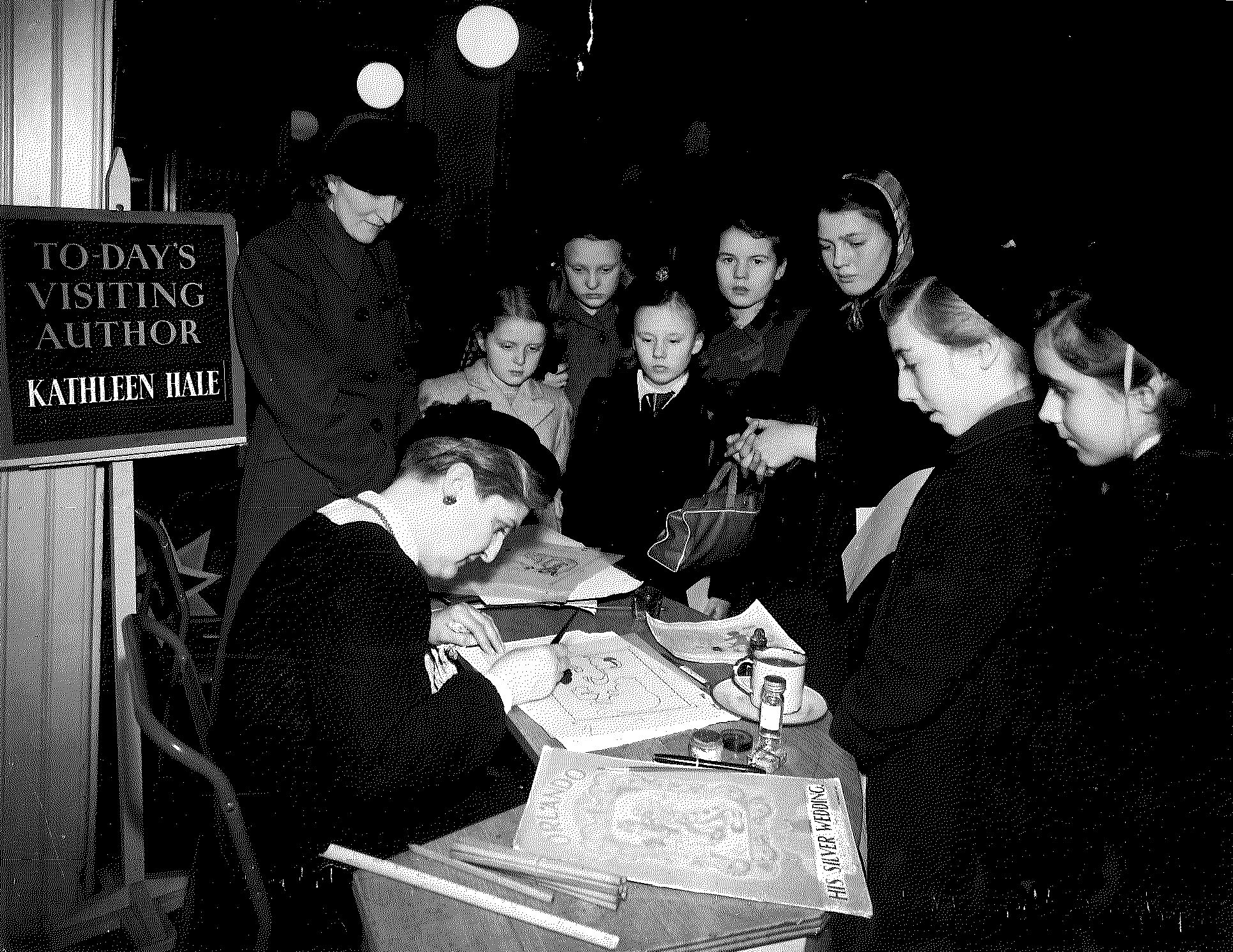
Author and illustrator Kathleen Hale at a demonstration station, (HC439/B/E/3/3).
Author and illustrator Kathleen Hale at a demonstration station, (HC439/B/E/3/3).
In this clip, hear Kathleen Hale discusses W.S. Cowell knowledge and skill which enabled the printing of the Orlando books. From Desert Island Discs 30th October 1994. BBC © copyright content reproduced courtesy of the British Broadcasting Corporation. All rights reserved.

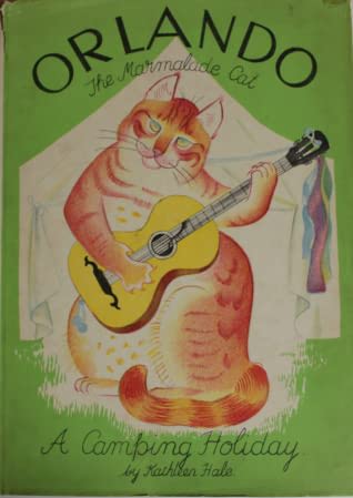
This book, first published in 1938, was the one which started the much-loved Orlando the Marmalade Cat series, which would see 19 books produced in total.
This book, first published in 1938, was the one which started the much-loved Orlando the Marmalade Cat series, which would see 19 books produced in total.

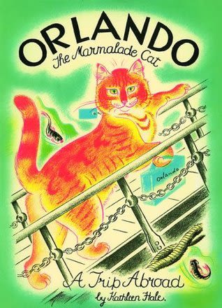
The second book in the series, published in 1939, saw Orlando take a trip aboard...
The second book in the series, published in 1939, saw Orlando take a trip aboard...

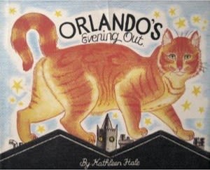
"Orlando's Evening out" was the third book in the series, published in 1941.
"Orlando's Evening out" was the third book in the series, published in 1941.
Tim and Lucy and Edward Ardizzone
He was a war artist, printmaker and both an illustrator and author of many books including the Little Tim Series.
In 1937 W.S. Cowell printed the artist Edward Ardizzone’s picture book Lucy Brown and Mr Grimes (Published by Oxford University Press). The book was a big step forward in printing as it was a collaboration between the artist and the printers to produce prints which were authentic to Ardizzone’s original illustrations. To recreate Ardizzone’s work his hand drawn black outlines were printed separately over the watercolour artwork to create fresh, vibrant illustrations.
Ardizzone spent his childhood in Ipswich and his interest in the port and the ships coming and going inspired some of his books such as Tim and Lucy Go to Sea.

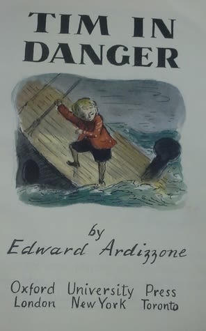
Finished Artwork for "Tim in Danger" by Edward Ardizzone. c.1953. Courtesy of Seven Stories.
Finished Artwork for "Tim in Danger" by Edward Ardizzone. c.1953. Courtesy of Seven Stories.

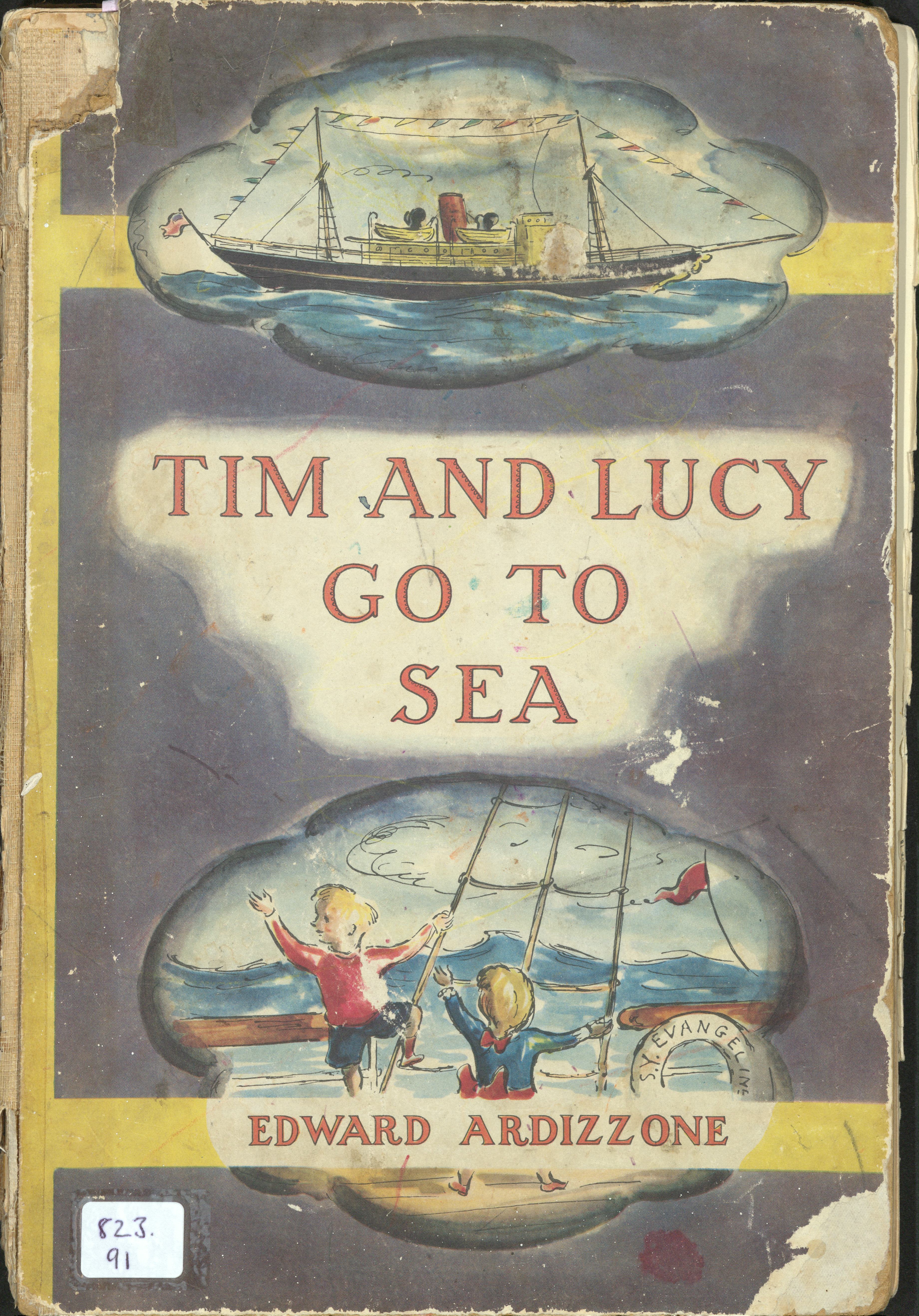
"Tim and Lucy Go to Sea". Reproduced with permission of the Licensor through PLSclear.
"Tim and Lucy Go to Sea". Reproduced with permission of the Licensor through PLSclear.

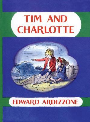

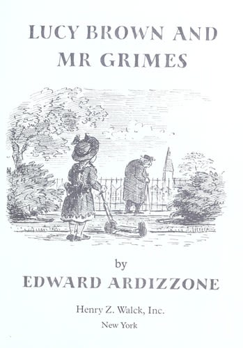
The front cover of the 1971 edition of "Lucy Brown and Mr Grimes".
The front cover of the 1971 edition of "Lucy Brown and Mr Grimes".
Post-War Years

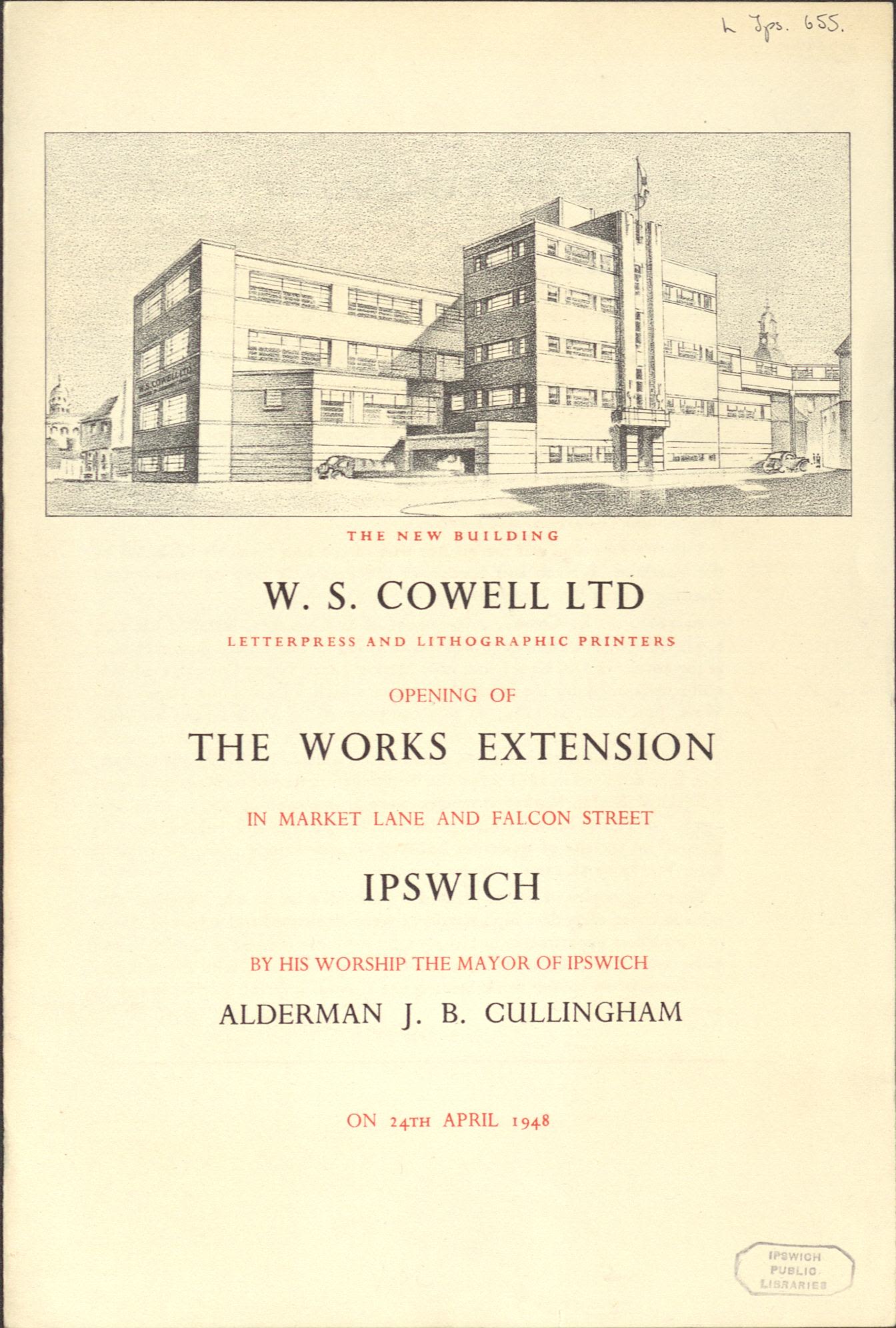
A pamphlet published for the opening of the W.S. Cowell printing works extension by JB Cullingham, Mayor of Ipswich on 24th April 1948, (HD2272/324/102)
A pamphlet published for the opening of the W.S. Cowell printing works extension by JB Cullingham, Mayor of Ipswich on 24th April 1948, (HD2272/324/102)
After early success with children’s picture books, W.S. Cowell drew up plans to grow the business by expanding the printworks and setting up a London office.
During World War Two (1939-1945) many members of W.S. Cowell workforce were conscripted to serve in the army. At the end of the war the company produced the booklet Your Post-War Job which was sent to all pre-war employees to encourage them to come back to work for the company.

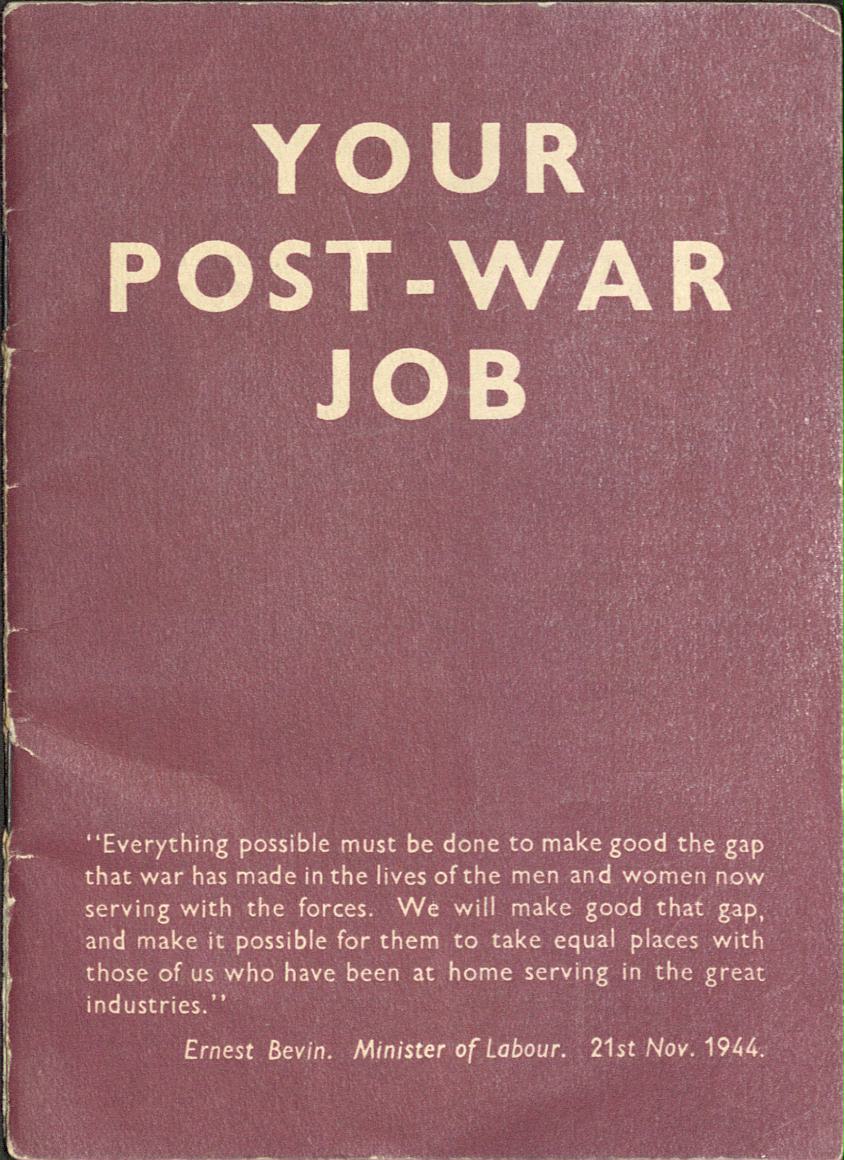
"Your Post War Job" booklet, (HC439/A/A/5/2/5).
"Your Post War Job" booklet, (HC439/A/A/5/2/5).
Two of the pages from this booklet are displayed below.

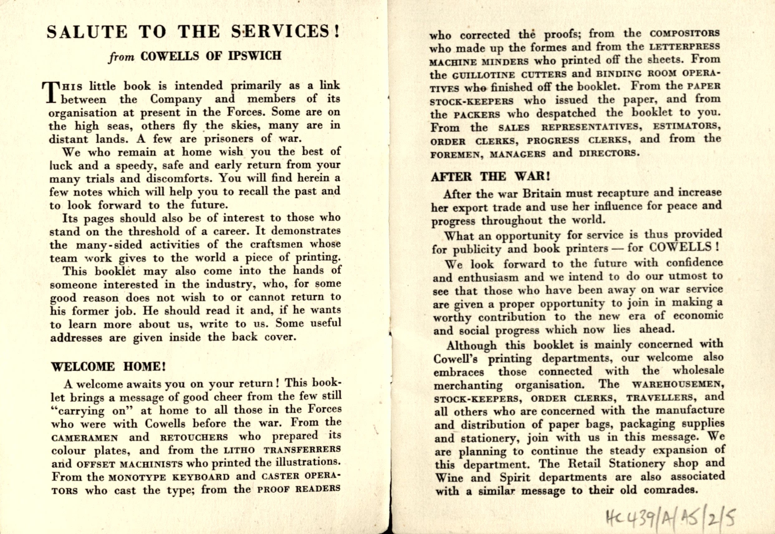
A page from "Your Post War Job" booklet, (HC439/A/A/5/2/5).
A page from "Your Post War Job" booklet, (HC439/A/A/5/2/5).

A second page from "Your Post War Job" booklet, (HC439/A/A/5/2/5).
A second page from "Your Post War Job" booklet, (HC439/A/A/5/2/5).
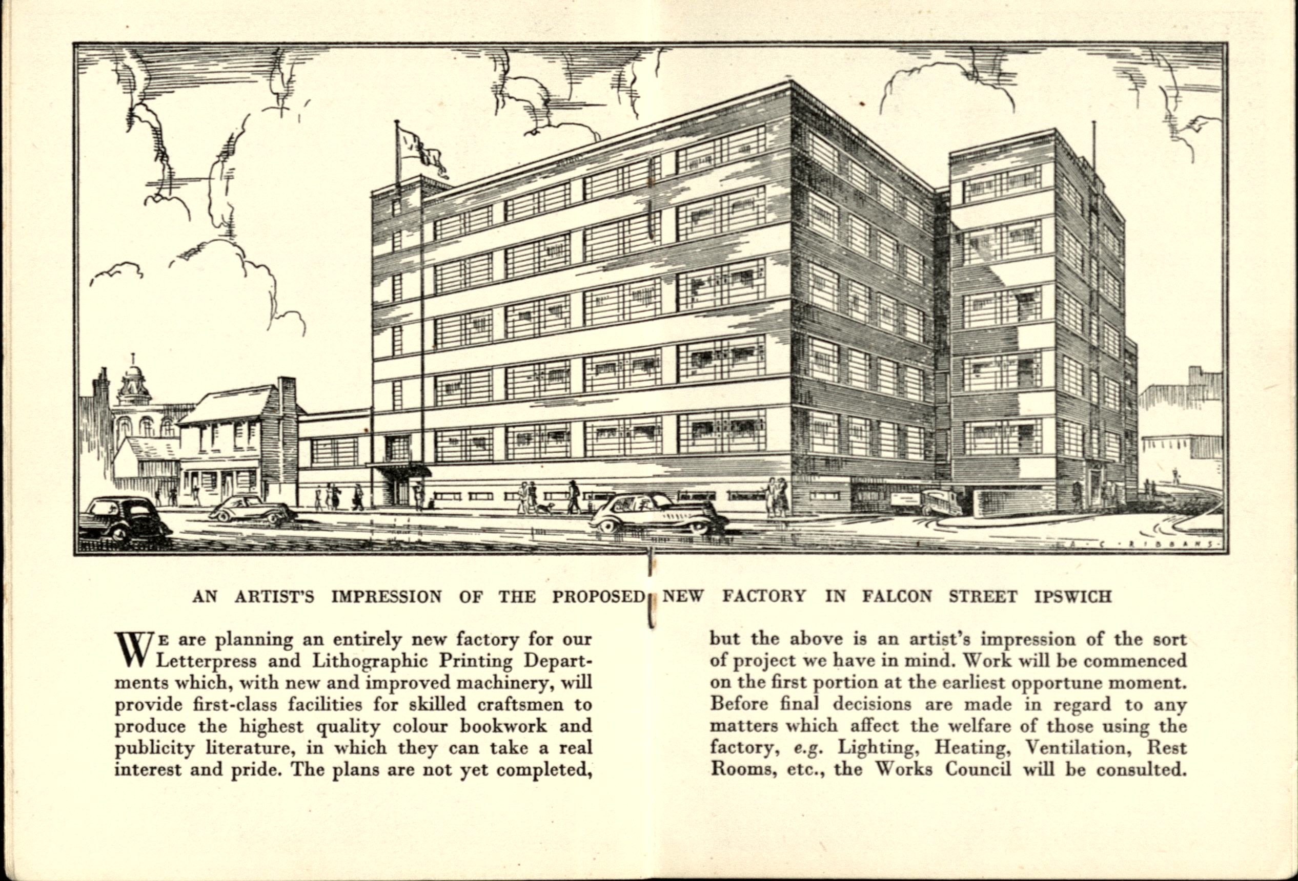
1948... A Successful Year For W.S. Cowell
During 1948 W.S Cowell finally opened its new factory....

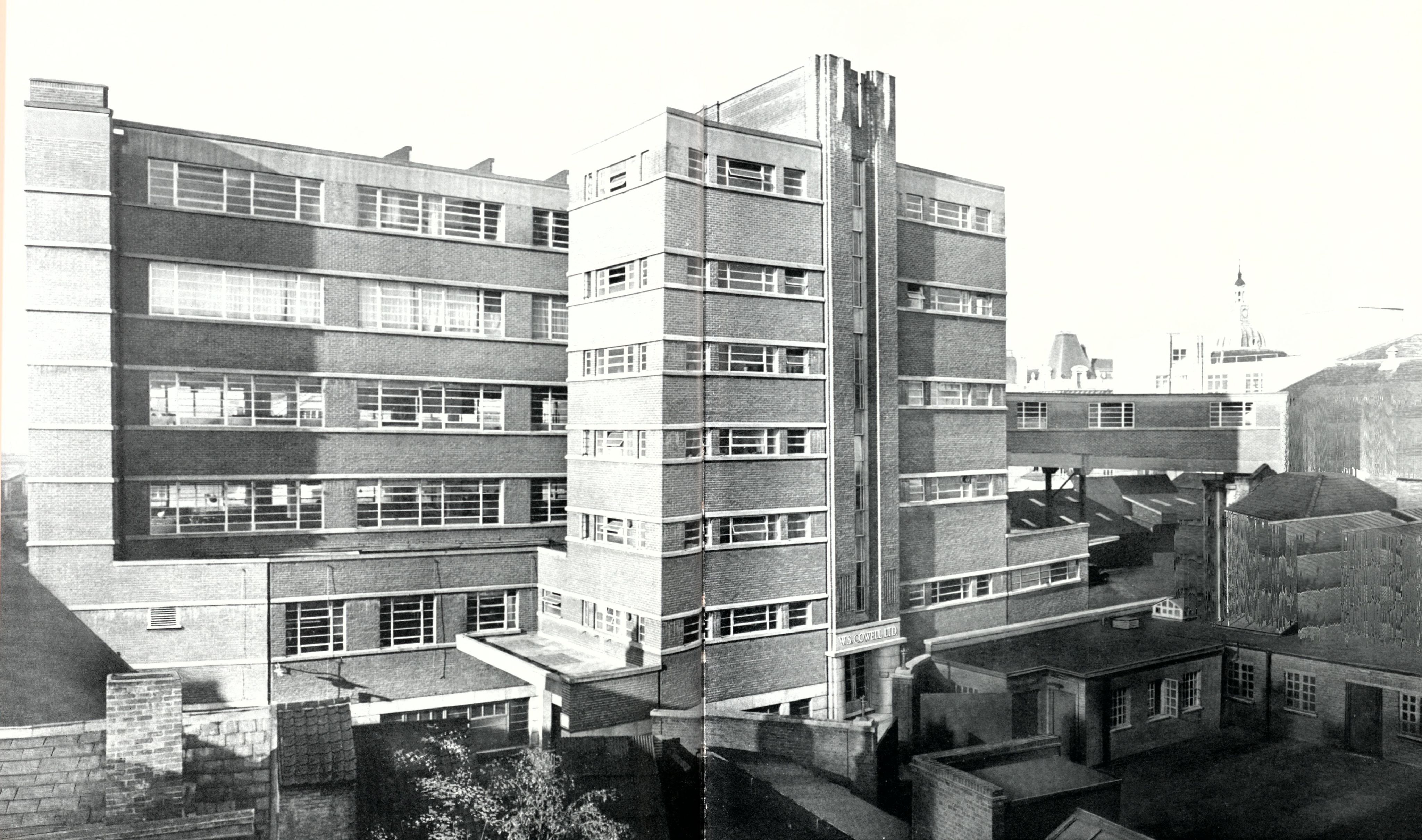
A view of the Extension - from "The press in the Buttermarket A Camera Study" by Geoffrey Ireland, (HC439/A/A/5/2/12).
A view of the Extension - from "The press in the Buttermarket A Camera Study" by Geoffrey Ireland, (HC439/A/A/5/2/12).

A photograph from the opening of the new factory extension at W.S. Cowell. 1948. (HC439/B/E/3/36).
A photograph from the opening of the new factory extension at W.S. Cowell. 1948. (HC439/B/E/3/36).

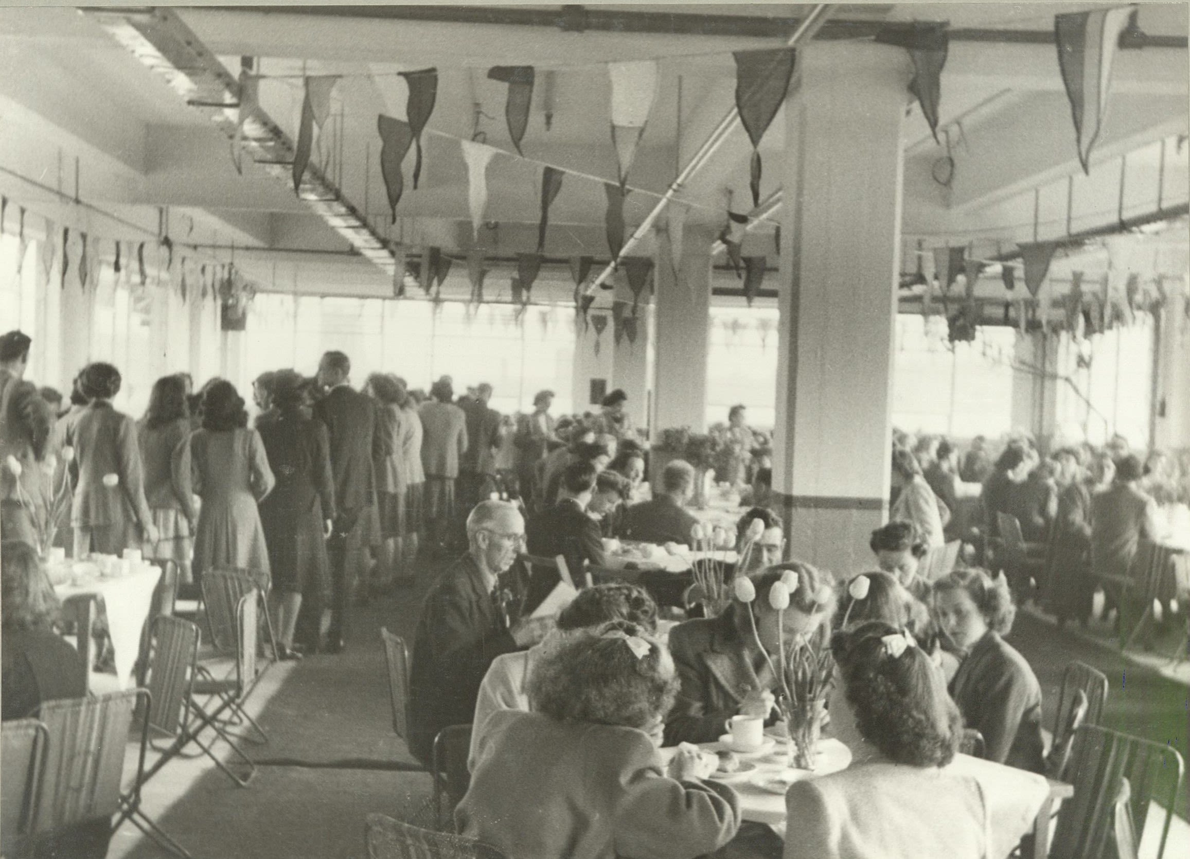
A photograph from the opening of the new factory extension at W.S. Cowell. 1948. (HC439/B/E/3/36).
A photograph from the opening of the new factory extension at W.S. Cowell. 1948. (HC439/B/E/3/36).

A photograph from the opening of the new factory extension at W.S. Cowell. 1948. (HC439/B/E/3/36).
A photograph from the opening of the new factory extension at W.S. Cowell. 1948. (HC439/B/E/3/36).
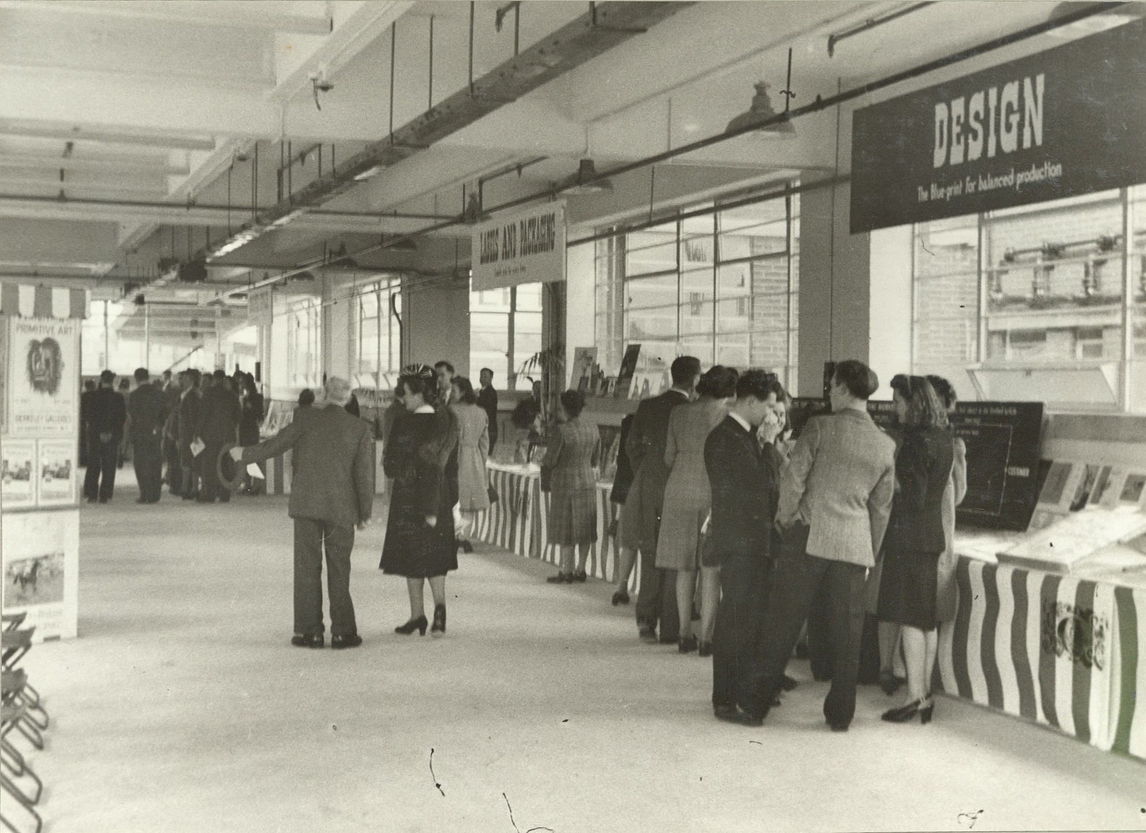
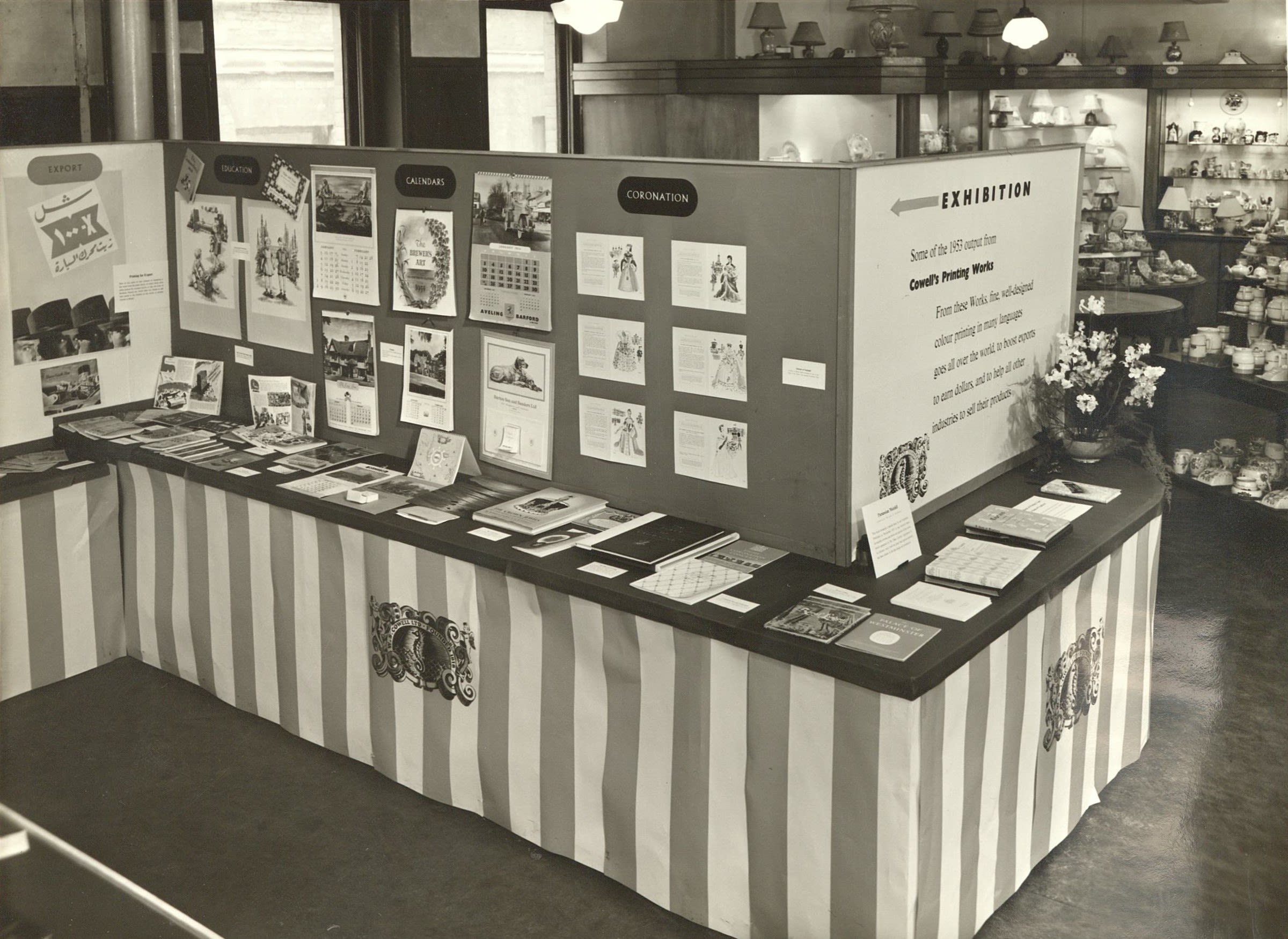
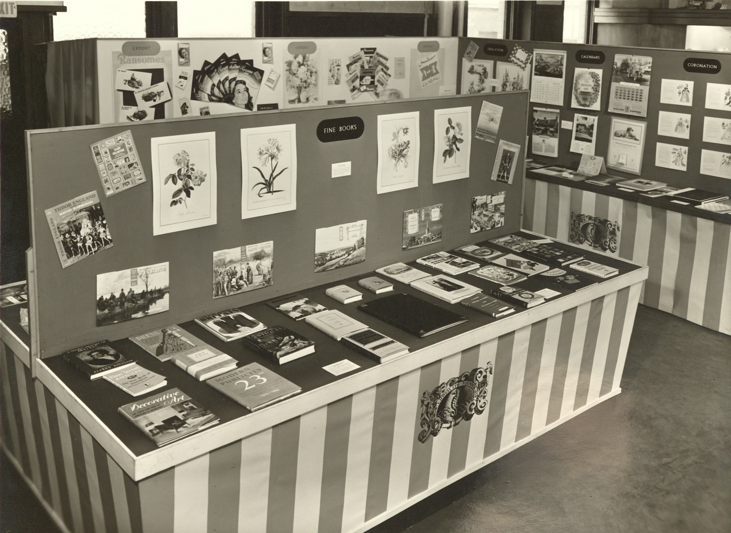
... W.S Cowell were also exhibited at the British Council Book Exhibition, Copenhagen...

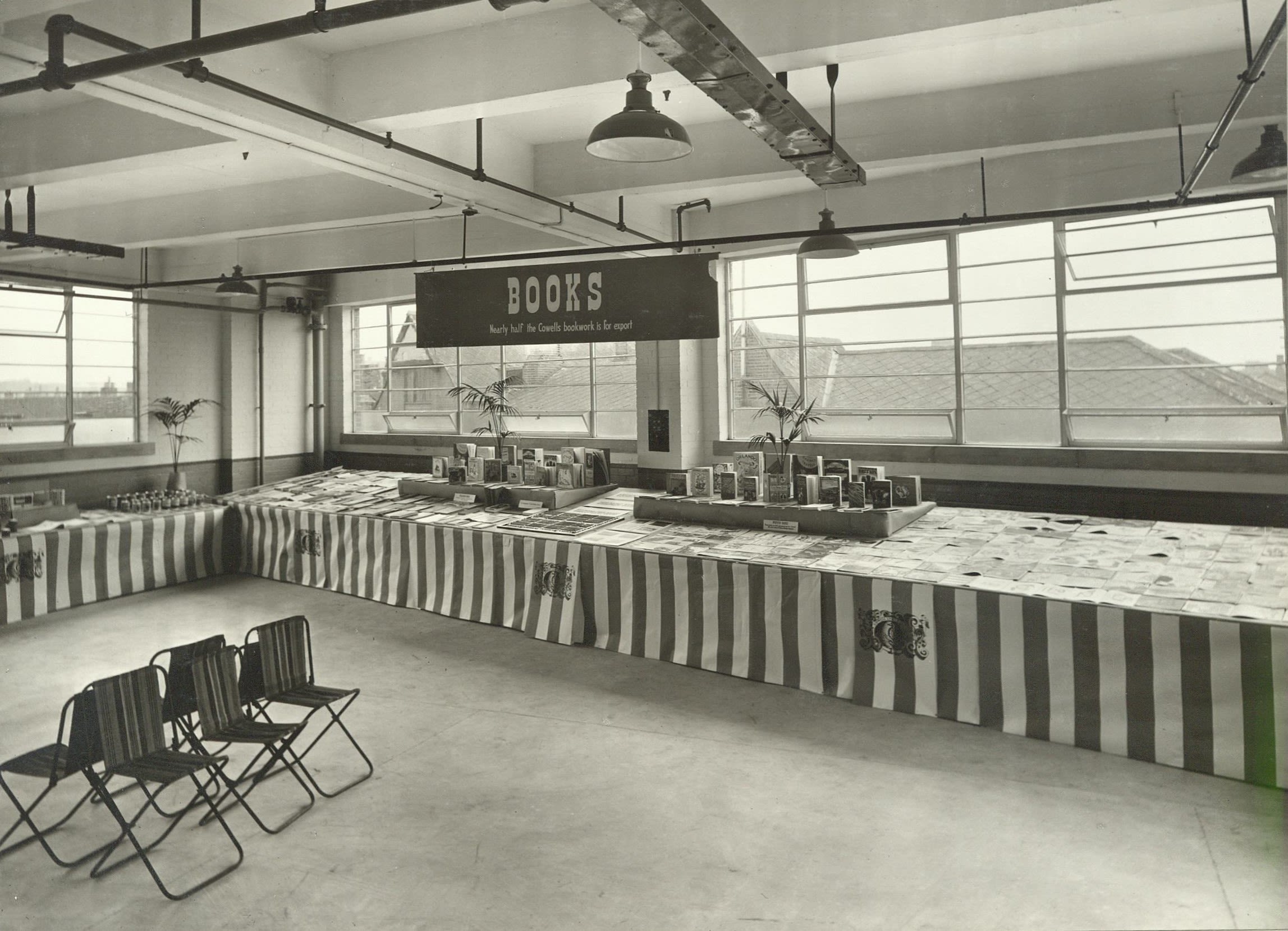
Publicity photograph of W.S. Cowell exhibit at the British Council Book Exhibition, Copenhagen, 1948 (HC439/B/E/3/47)
Publicity photograph of W.S. Cowell exhibit at the British Council Book Exhibition, Copenhagen, 1948 (HC439/B/E/3/47)

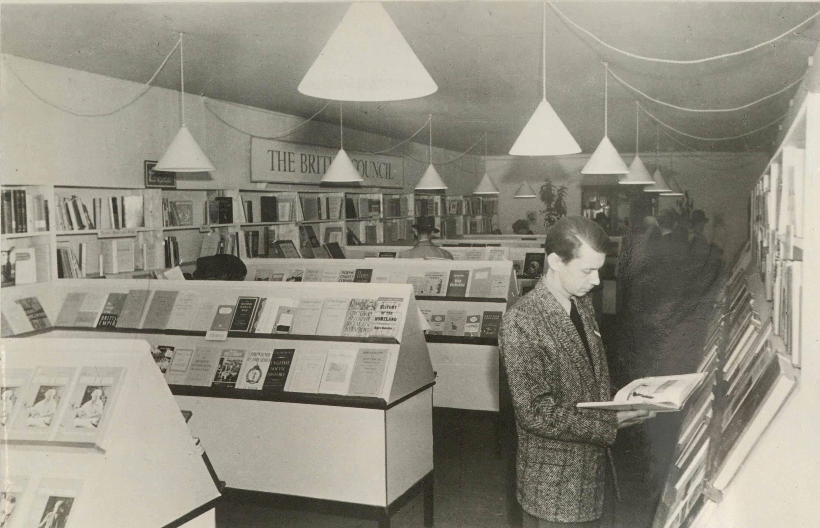
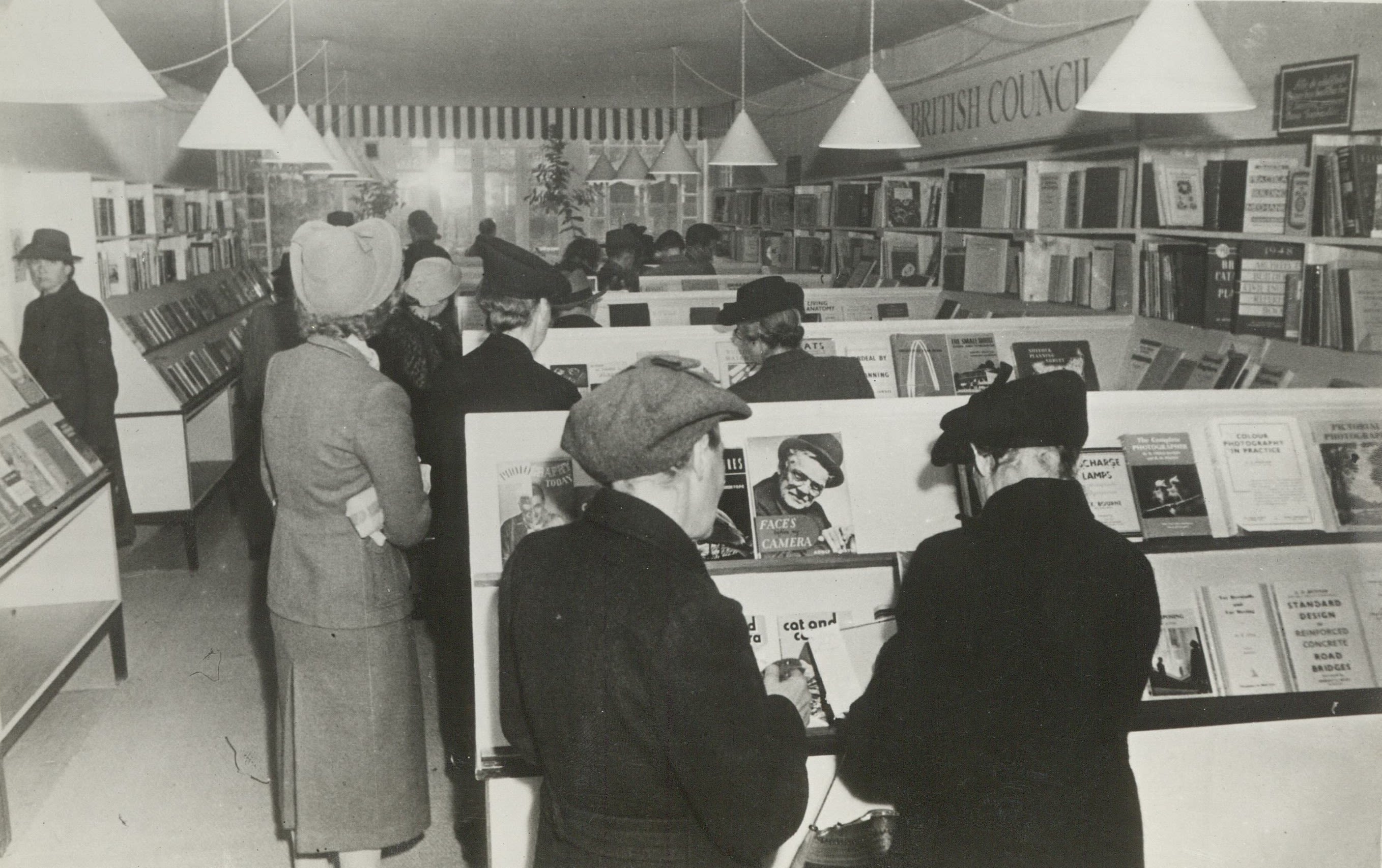
Publicity photograph of W.S. Cowell exhibit at the British Council Book Exhibition, Copenhagen, (HC439/B/E/3/47).
Publicity photograph of W.S. Cowell exhibit at the British Council Book Exhibition, Copenhagen, (HC439/B/E/3/47).

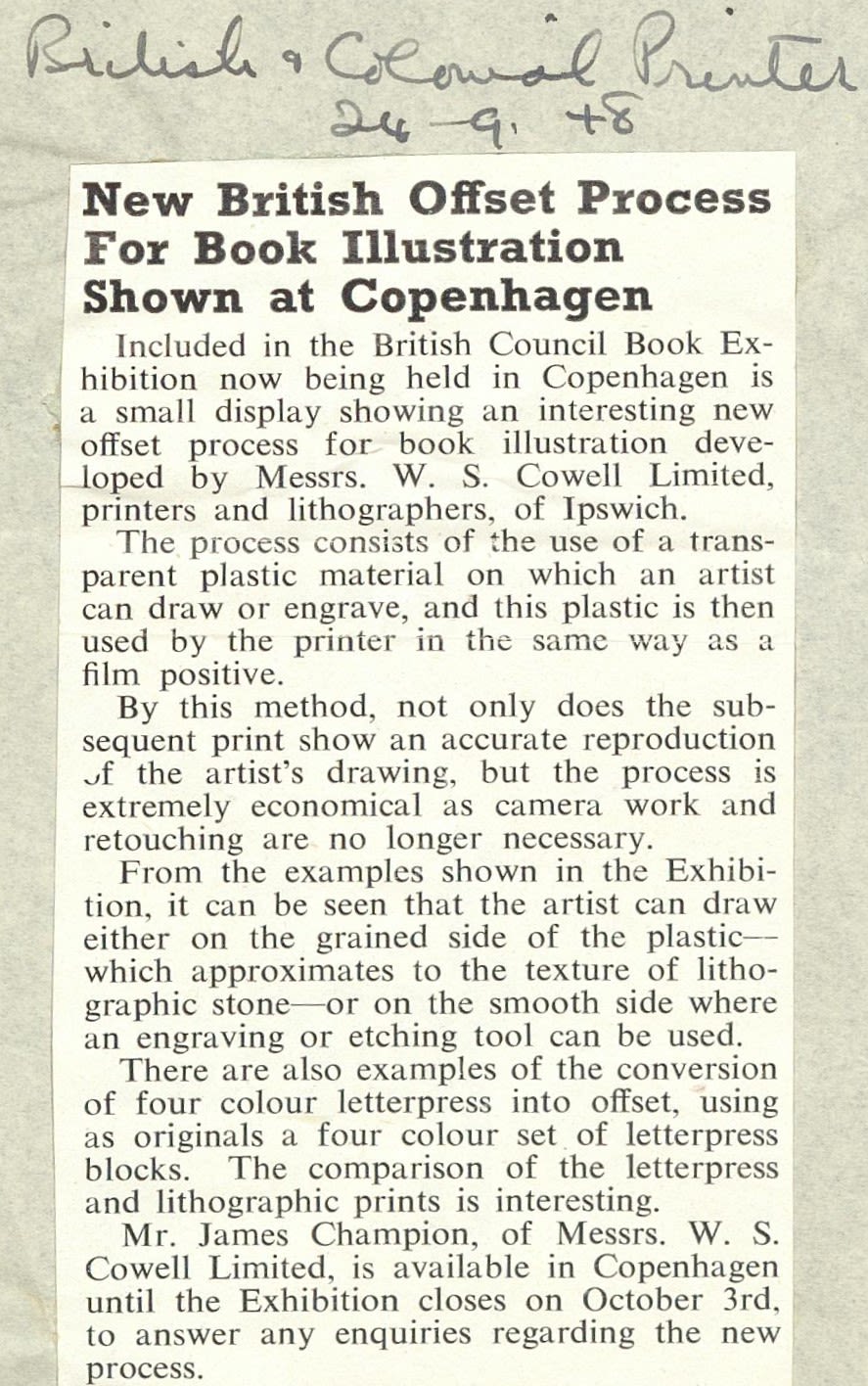
Newspaper articles about W.S. Cowell going to the British Council Book Exhibition, Copenhagen. 1948, (HC439/B/E/3/3).
Newspaper articles about W.S. Cowell going to the British Council Book Exhibition, Copenhagen. 1948, (HC439/B/E/3/3).

Newspaper article about W.S. Cowell books being chosen for the National Book League annual exhibition, (HC439/B/E/3/3).
Newspaper article about W.S. Cowell books being chosen for the National Book League annual exhibition, (HC439/B/E/3/3).
... And were chosen for the National Book League annual exhibition.
Eric Ravilious
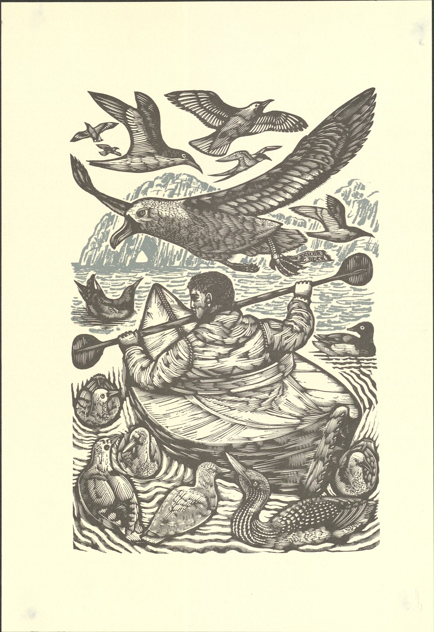
Eric Ravilious was a war artist and during World War Two produced a series of prints about life on board submarines. The War Artists’ Advisory committee (WAAC) wanted the prints made into a children’s book but the printing cost was far too high. Instead Ravilious asked W.S. Cowell to print the works as individual images which was much more affordable. Ravilious enjoyed working with W.S. Cowell and having the ability to experiment with his work and the printing process.
Ravilous died at the age of 39 when the plane he was travelling on failed to return from a flight over Iceland.
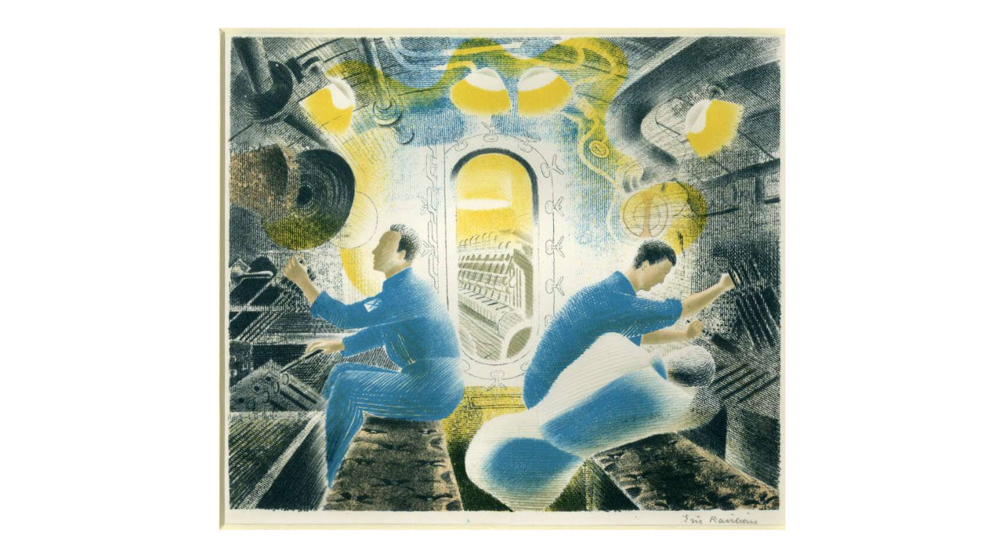
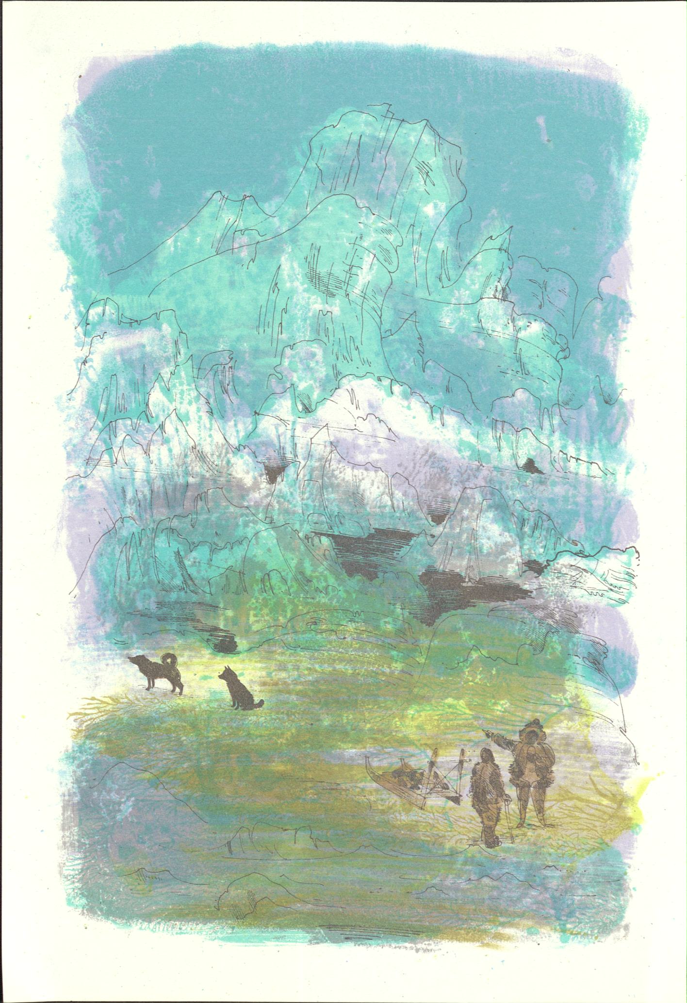
A colour lithograph of three men in control room of submarine. Created in 1941.
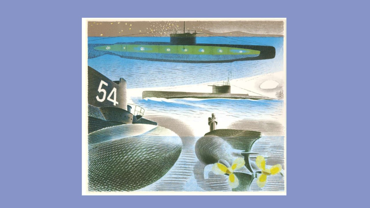
A colour lithograph of four different views of a submarine. Created in 1941.
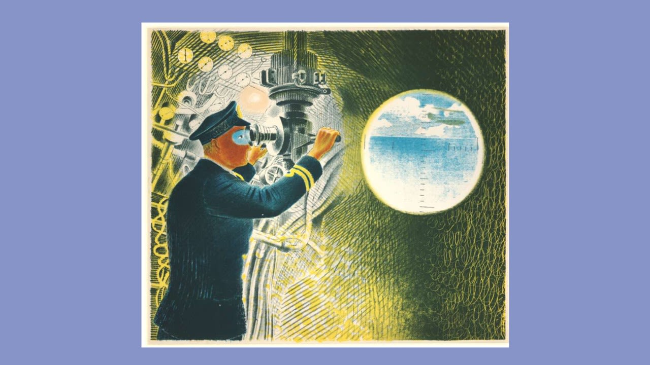
A colour lithograph of an officer looking through the periscope of a submarine, with a circular representation of what he can see. Created in 1941

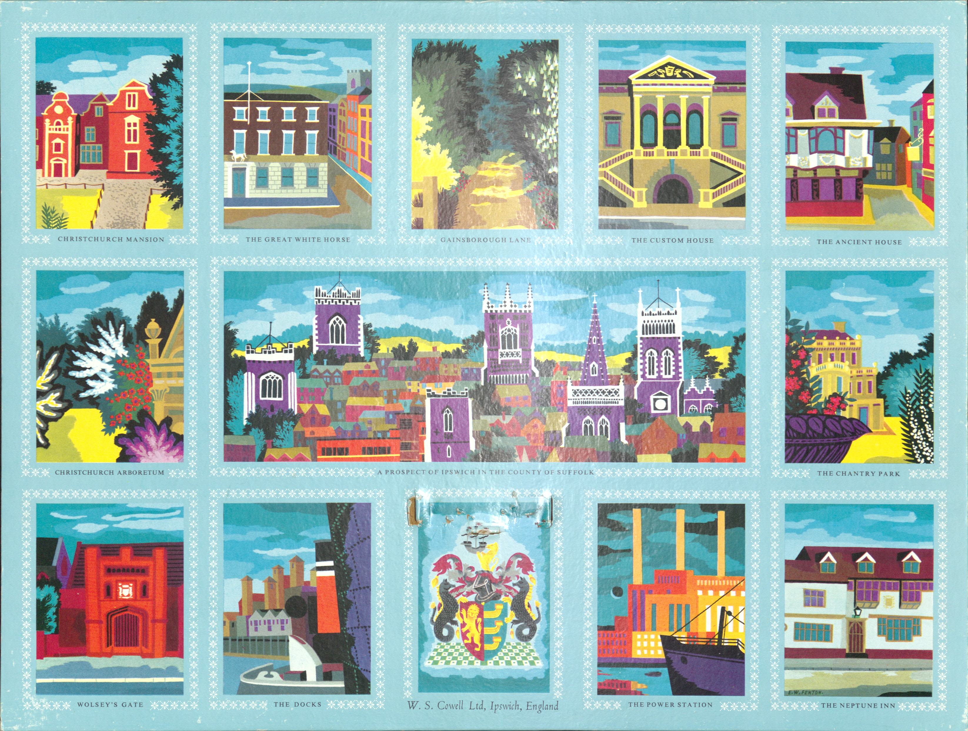


A Prospect of Ipswich by William Fenton, 1958 (HC439/A/E/2/1)
A Prospect of Ipswich by William Fenton, 1958 (HC439/A/E/2/1)

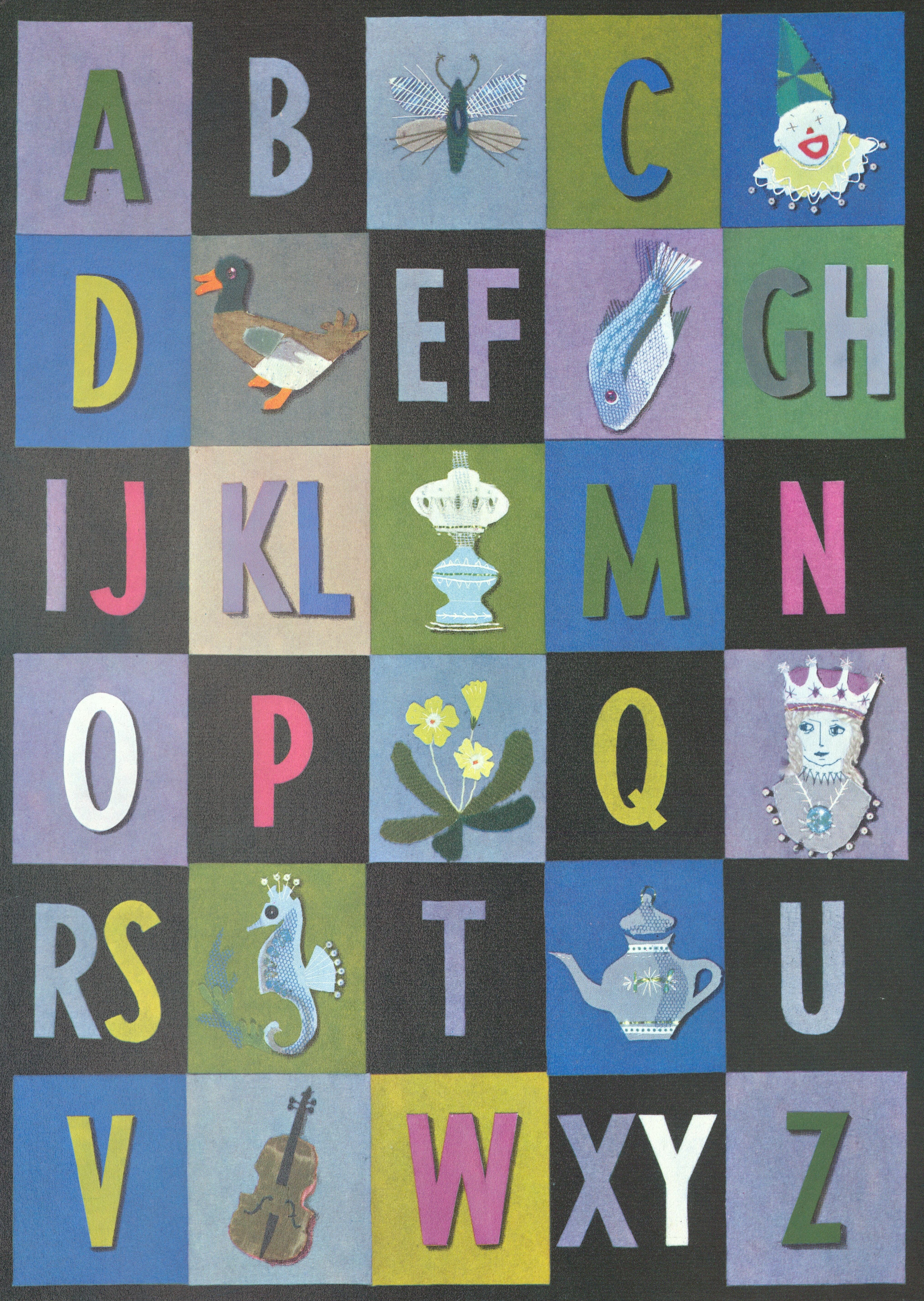
An Alphabet by Catherine Broom-Lynne, 1966 (HC439/A/E/2/1)
An Alphabet by Catherine Broom-Lynne, 1966 (HC439/A/E/2/1)

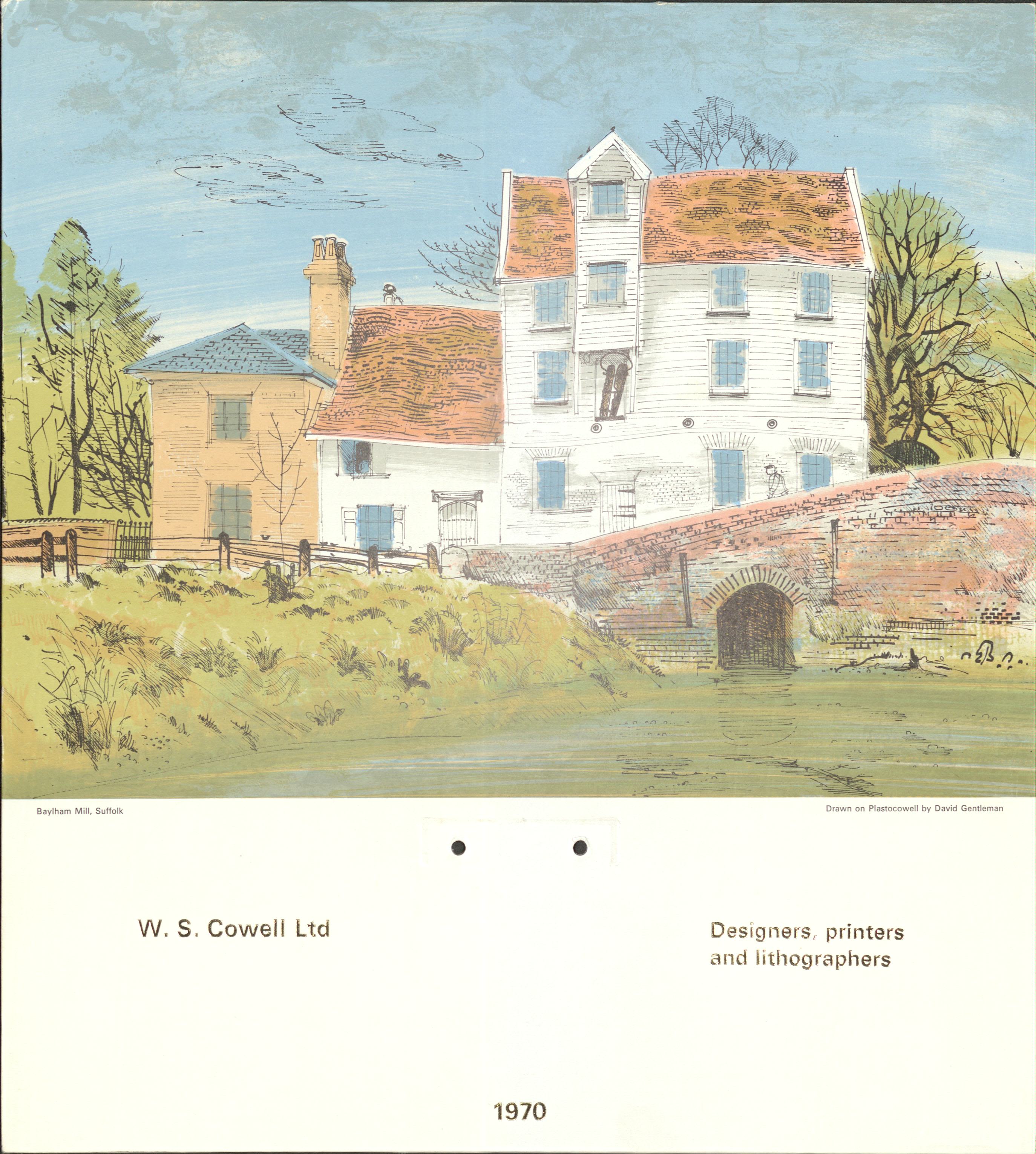
Baylham Mill, Suffolk by David Gentleman, 1970 (HC439/A/E/2/1) Click on the image to make it larger.
Baylham Mill, Suffolk by David Gentleman, 1970 (HC439/A/E/2/1) Click on the image to make it larger.

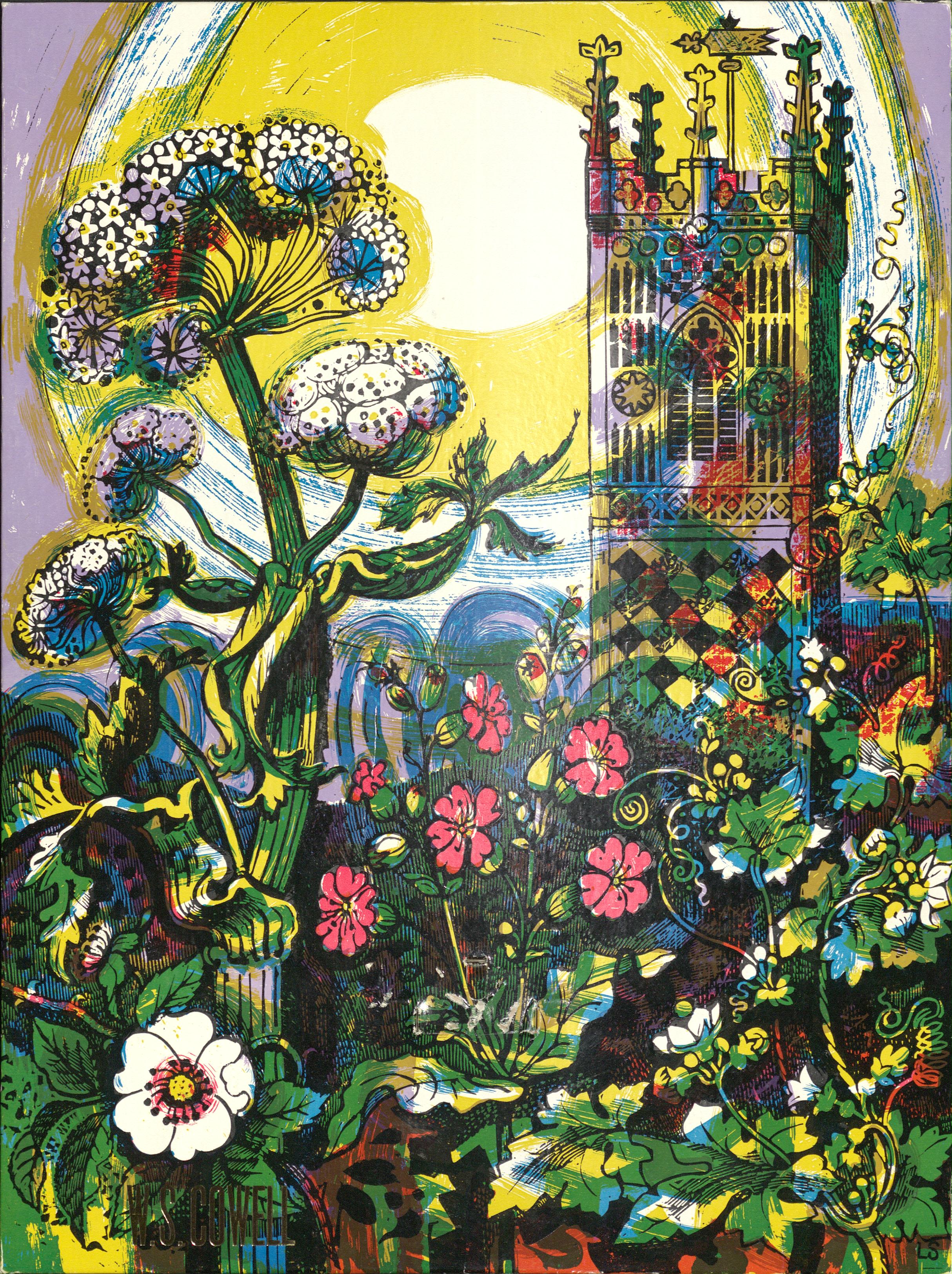
Suffolk Summer by Laurence Scarfe. Featuring meadows from the River Deben and the church tower of St Lawrence in Ipswich, 1965 (HC439/A/E/2/1)
Suffolk Summer by Laurence Scarfe. Featuring meadows from the River Deben and the church tower of St Lawrence in Ipswich, 1965 (HC439/A/E/2/1)

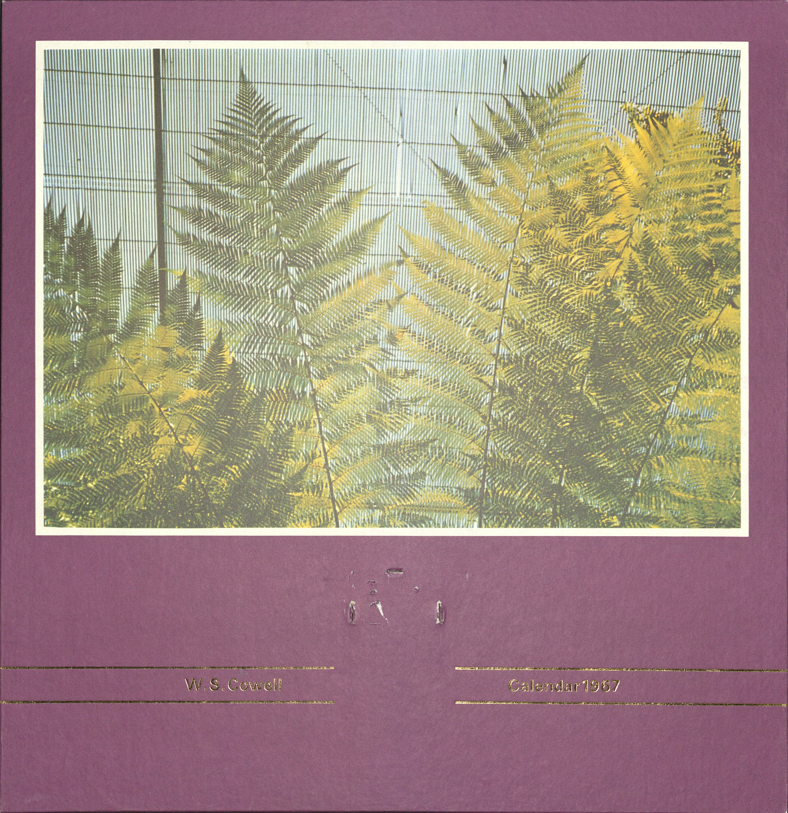
Palm Leaves by Geoffrey Ireland, 1967 (HC439/A/E/2/1)
Palm Leaves by Geoffrey Ireland, 1967 (HC439/A/E/2/1)

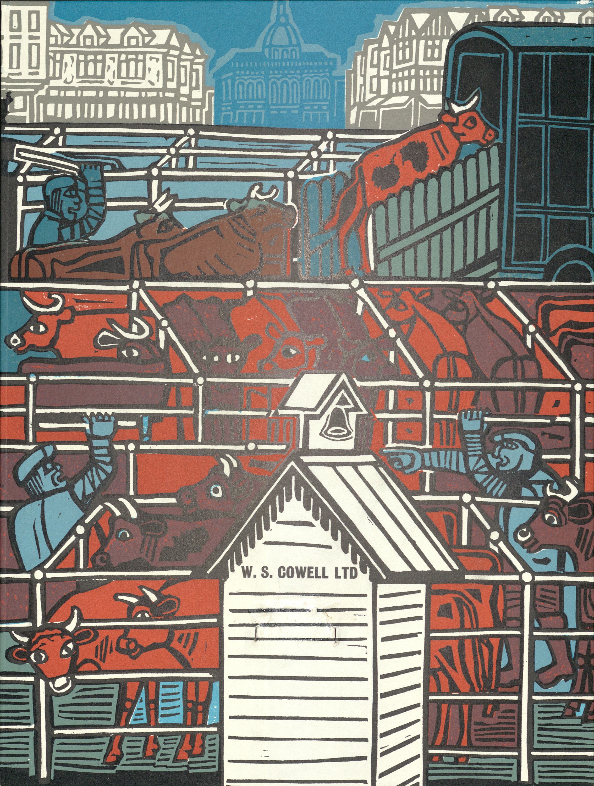
Suffolk Market by Edward Bawden, 1963 (HC439/A/E/2/1)
Suffolk Market by Edward Bawden, 1963 (HC439/A/E/2/1)

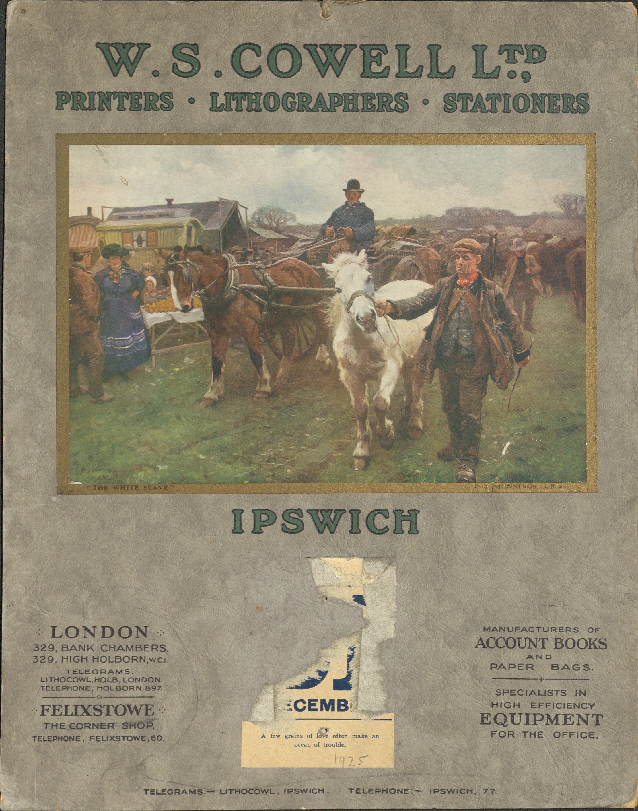
Reproduction of Alfred Munnings’ painting The White Slave. Calendar for 1925 (HC439/A/E/2/1)
Reproduction of Alfred Munnings’ painting The White Slave. Calendar for 1925 (HC439/A/E/2/1)

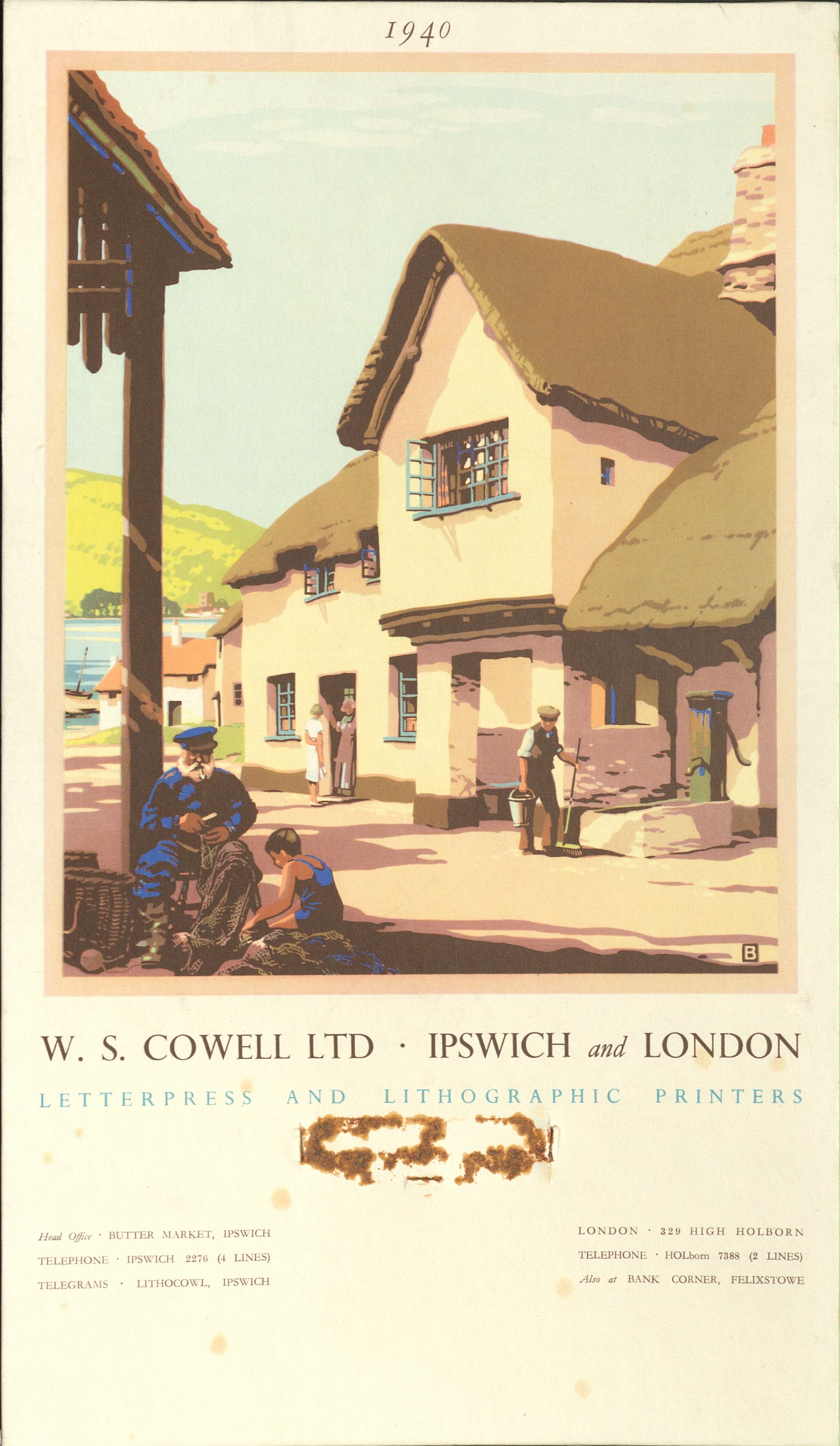
Scene of a traditional fishing town, 1940 (HC439/A/E/2/1)
Scene of a traditional fishing town, 1940 (HC439/A/E/2/1)

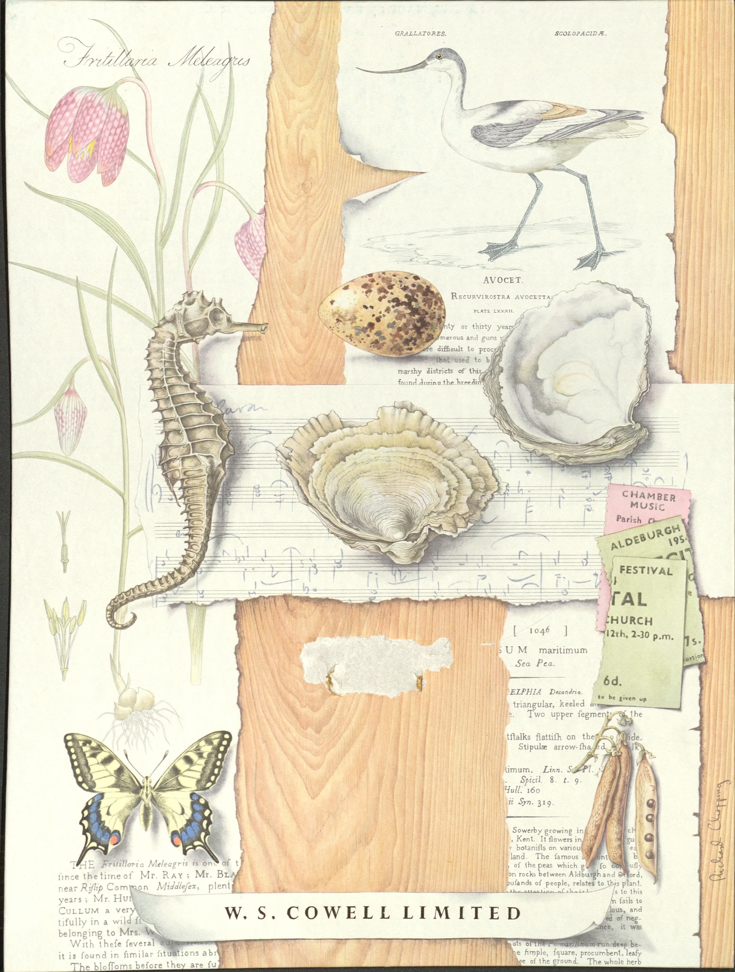
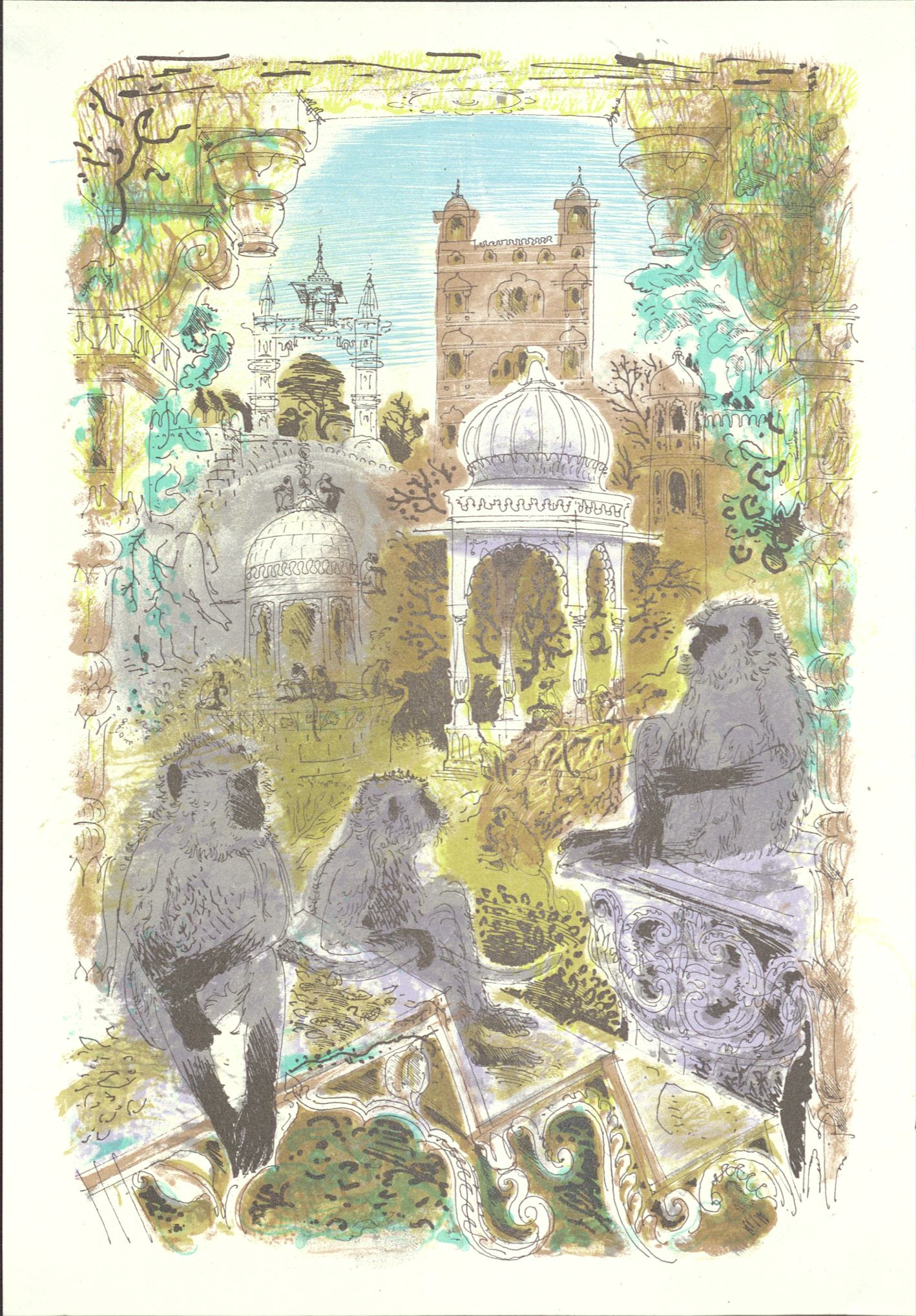
A Suffolk Miscellany by Richard Chopping. This design features a collection of items chosen by W.S. Cowell which represent the cultural and natural life of Suffolk. Including oysters from Butley, a composition by Benjamin Britten, fritillaries, an avocet and a ticket to the Aldeburgh festival, 1961 (HC439/A/E/2/1)
A Suffolk Miscellany by Richard Chopping. This design features a collection of items chosen by W.S. Cowell which represent the cultural and natural life of Suffolk. Including oysters from Butley, a composition by Benjamin Britten, fritillaries, an avocet and a ticket to the Aldeburgh festival, 1961 (HC439/A/E/2/1)

The Old Customs House, Ipswich by Richard Bawden, 1972 (HC439/A/E/2/1)
The Old Customs House, Ipswich by Richard Bawden, 1972 (HC439/A/E/2/1)
Puffin Picture Books
Publisher and editor Noel Carrington wanted to produce affordable, informative children’s picture books and approached Penguin Books, the publisher, with the idea. Penguin had launched in 1935 aiming to make reading accessible to everyone so were keen to join in with Carrington’s project. Carrington wanted the books to be sold for sixpence (approximately £1.30 today), the same price as the original Penguin books.
Without even checking W.S. Cowell Manager Geoffrey Smith promised they could produce the books to be sold for 6p as he knew the project would be successful, and that W.S. Cowell should be part of it.
Together the team came up with a smaller format for the series so the finished books could be packed more economically. By printing 16 pages to one sheet of printer paper, with one side in colour and the other in black and white, they were able to reduce the price further. This meant the finished books could be sold at an affordable price.
W. S. Cowell were retained by Penguin to print Puffin Picture Books for 25 years. In that time they produced over half of the 120 titles, including many foreign language editions. They also saw the first and last Puffin books rolling off their presses, with the final edition appropriately called Seashore Life (1965).
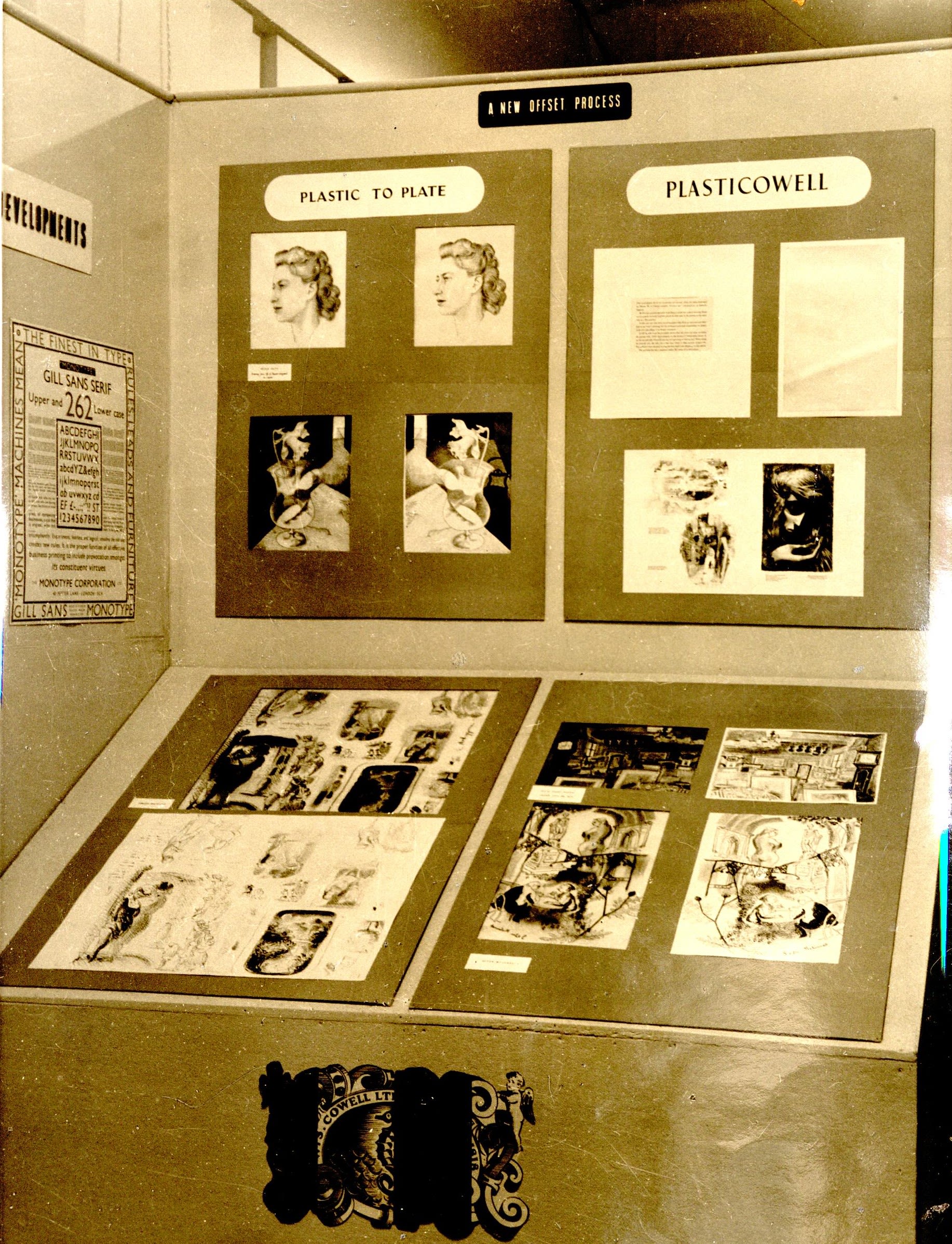
PlastiCowell
Lithography is a printing technique where a design is drawn onto a flat surface, usually a metal plate, from which the print would be taken. W. S Cowell’s innovation was to introduce plastic into this process instead. They called this new product PlastiCowell.
PlastiCowell was helpful for artists as they could draw and design directly onto the material which would be used for printing. It was also easy for artists to see through the clear sheets of PlastiCowell so they could separate out layers for printing easily. Such as colours and black outlines, or separating colours to be printed individually by simply laying the sheets on top of each other as they worked.
This was a significant development both as a new technology, but also as it made printing illustrations much cheaper. PlastiCowell demonstrates W.S. Cowell commitment to working directly with artists and involving them in the printing process.
An example of PlastiCowell, taken from the book entitled "Autolithographic Progress and Plastic Film" by R Geoffrey Smith, (HC439/A/A/5/2/9). Reprinted from The Penrose Annual, Vol XLIII. This book discusses what PlastiCowell is, how it works and how successfully it has already been used.
An example of PlastiCowell, taken from the book entitled "Autolithographic Progress and Plastic Film" by R Geoffrey Smith, (HC439/A/A/5/2/9). Reprinted from The Penrose Annual, Vol XLIII. This book discusses what PlastiCowell is, how it works and how successfully it has already been used.

Display of PlastiCowell at W.S Cowell's headquarters
Display of PlastiCowell at W.S Cowell's headquarters

London exhibition, with W.S Cowell exhibiting PlastiCowell.
London exhibition, with W.S Cowell exhibiting PlastiCowell.

London exhibition, with W.S Cowell exhibiting PlastiCowell.
London exhibition, with W.S Cowell exhibiting PlastiCowell.
Forsyte Sage - PlastiCowell
The below are illustrations by Anthony Gross for Forsyte Saga by Galsworthy, 1950. Drawn on PlastiCowell and printed by W.S. Cowell.
School Prints Series
In 1948 Brenda Rawnsley was working on a project to produce a series of affordable prints of artworks for schools to use in the classroom instead of expensive books. Brenda wanted to approach the best European artists to add to the existing series. As PlastiCowell was very portable this was the perfect material for the project and W.S. Cowell got involved.
Working with W.S. Cowells they produced a series of six prints all of original artworks by the best artists of the time.
Part 1: Hear how the School Prints Series came to fruition.
W.S Cowell Summer School Prints
During the summer of 2022, Suffolk Archives worked with Tower Street Print Project to deliver a week long summer school. GCSE and A-Level students were inspired by the W.S Cowell collection at Suffolk Archives to develop thier own orginal illustrations. The team selected buildings in Ipswich which are important for young people and worked with Tower Street Print Porject to learn and use a range of print making technquies to create thier final pieces.
Their illustrations were used on posters, flyers and other marketing materials for the Picture Books for All Exhibition.
The below video showcases original artwork produced by Euala, Rose and Megan.
Promoting a Business

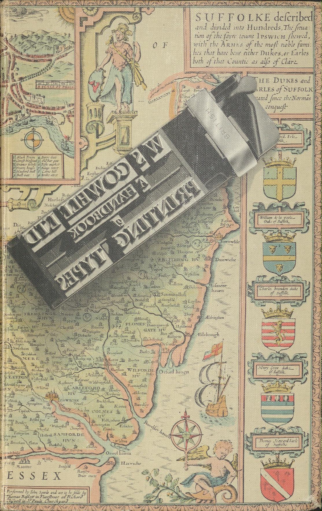
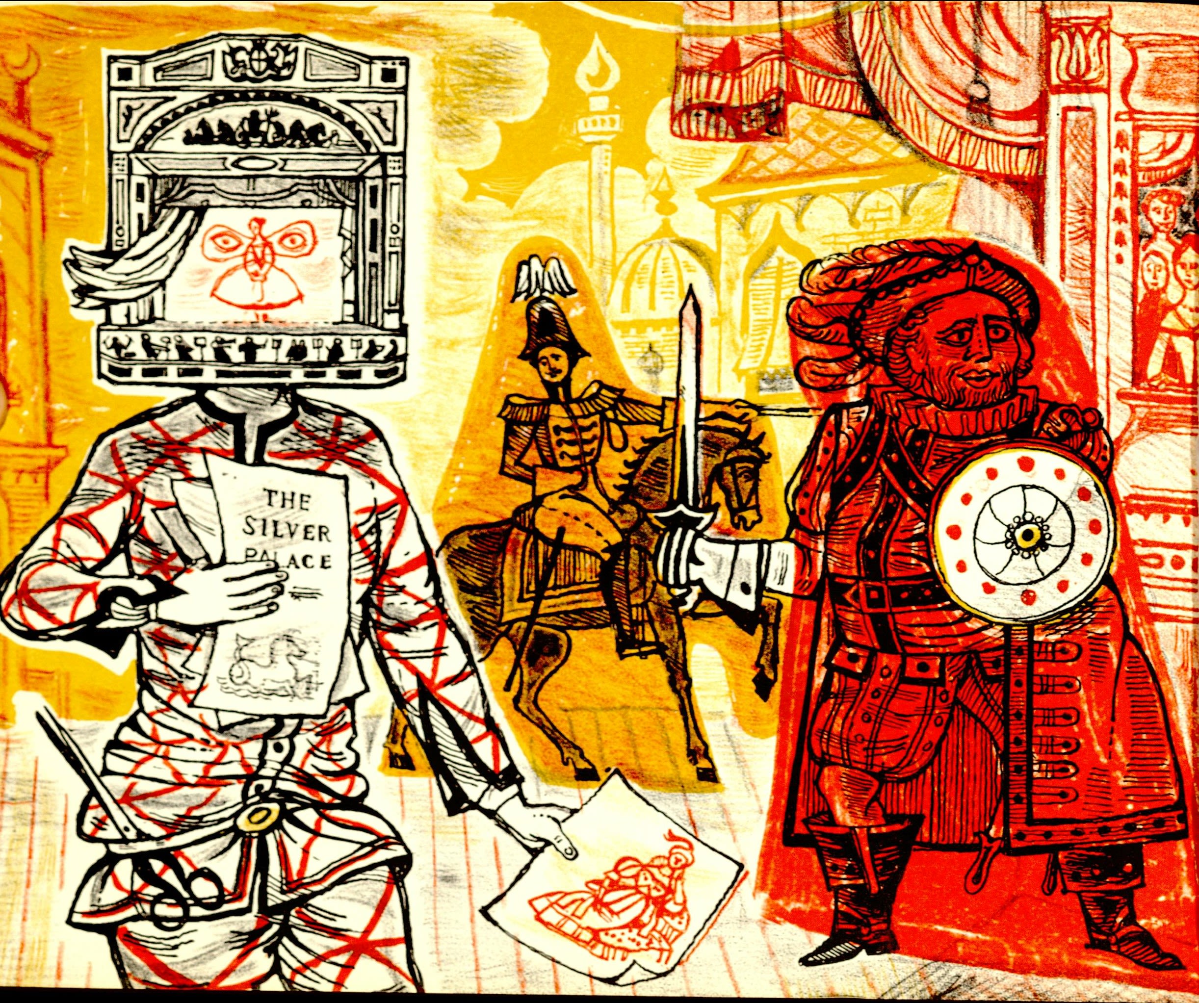
The front cover of "A Handbook of Types and Illustrations", (HC439/A/A/5/2/7).
The front cover of "A Handbook of Types and Illustrations", (HC439/A/A/5/2/7).
A Handbook of Types and Illustrations.
Illustrator John Lewis was hired by W.S. Cowell in 1947 to set up a design department. He didn’t know much about print or typography so to help learn he produce the book A Handbook of Printing Types (left). This book contained examples of typefaces or fonts used by W.S. Cowell. To illustrate his book Lewis commissioned artwork from contemporary artists, including Henry Moore and John Nash, to sit alongside typographic advice and examples of W.S. Cowell typefaces.
Leaflet advertising "A Handbook of Types and Illustrations", (HD2272/324/97).
Leaflet advertising "A Handbook of Types and Illustrations", (HD2272/324/97).
Lewis’ book demonstrated W.S. Cowell high-quality printing including illustrations, book work and their collection of typefaces. The book cover was a map of Suffolk which showed Ipswich as a centre of printing expertise.
The map used on the front cover of "A Handbook of Types and Illustrations" actually comes from a county map of Suffolk by John Speed, dating to the 17th Century (C/3/10/8/4/1).

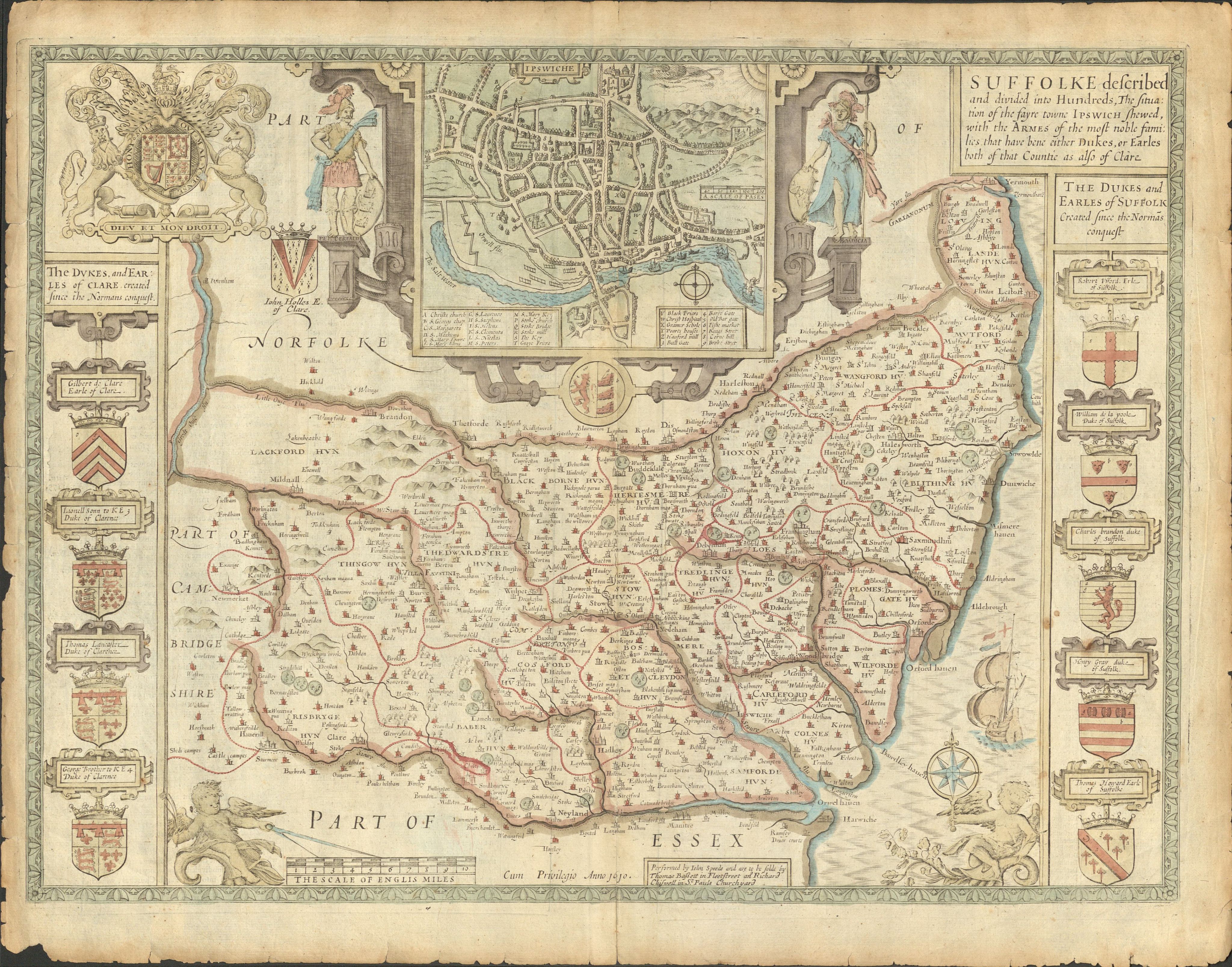
Printed county map of Suffolk by John Speed 17th century (C/3/10/8/4/1)
Printed county map of Suffolk by John Speed 17th century (C/3/10/8/4/1)
Other books and leaflets - produced around a similar time - also show type fonts and illustrations used at the time.

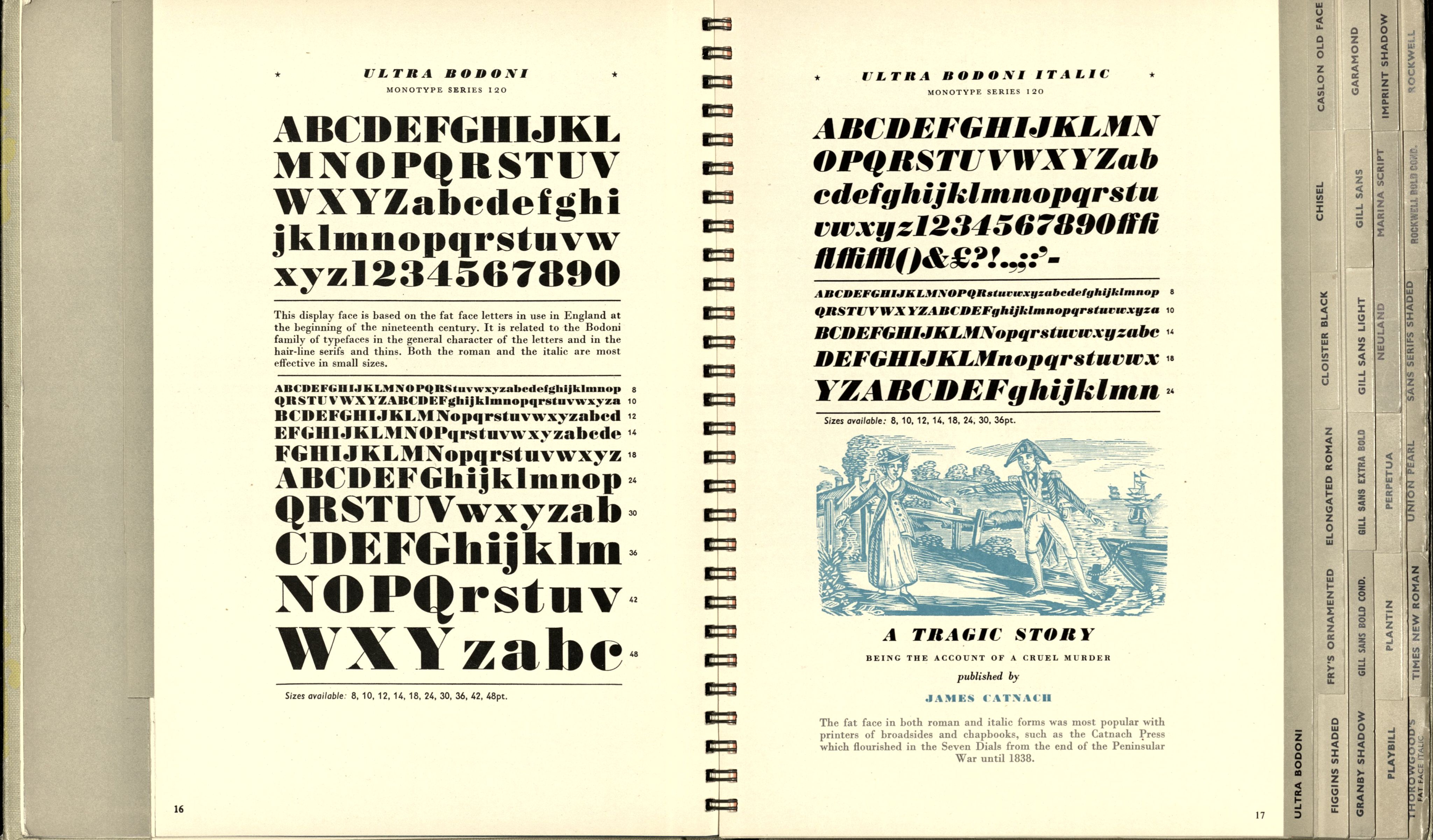
A page from "A Book of Typefaces: With some illustrated examples of text and display setting". This book contains example of fonts and their possible applications, 1954, (HC439/A/E/5/3).
A page from "A Book of Typefaces: With some illustrated examples of text and display setting". This book contains example of fonts and their possible applications, 1954, (HC439/A/E/5/3).

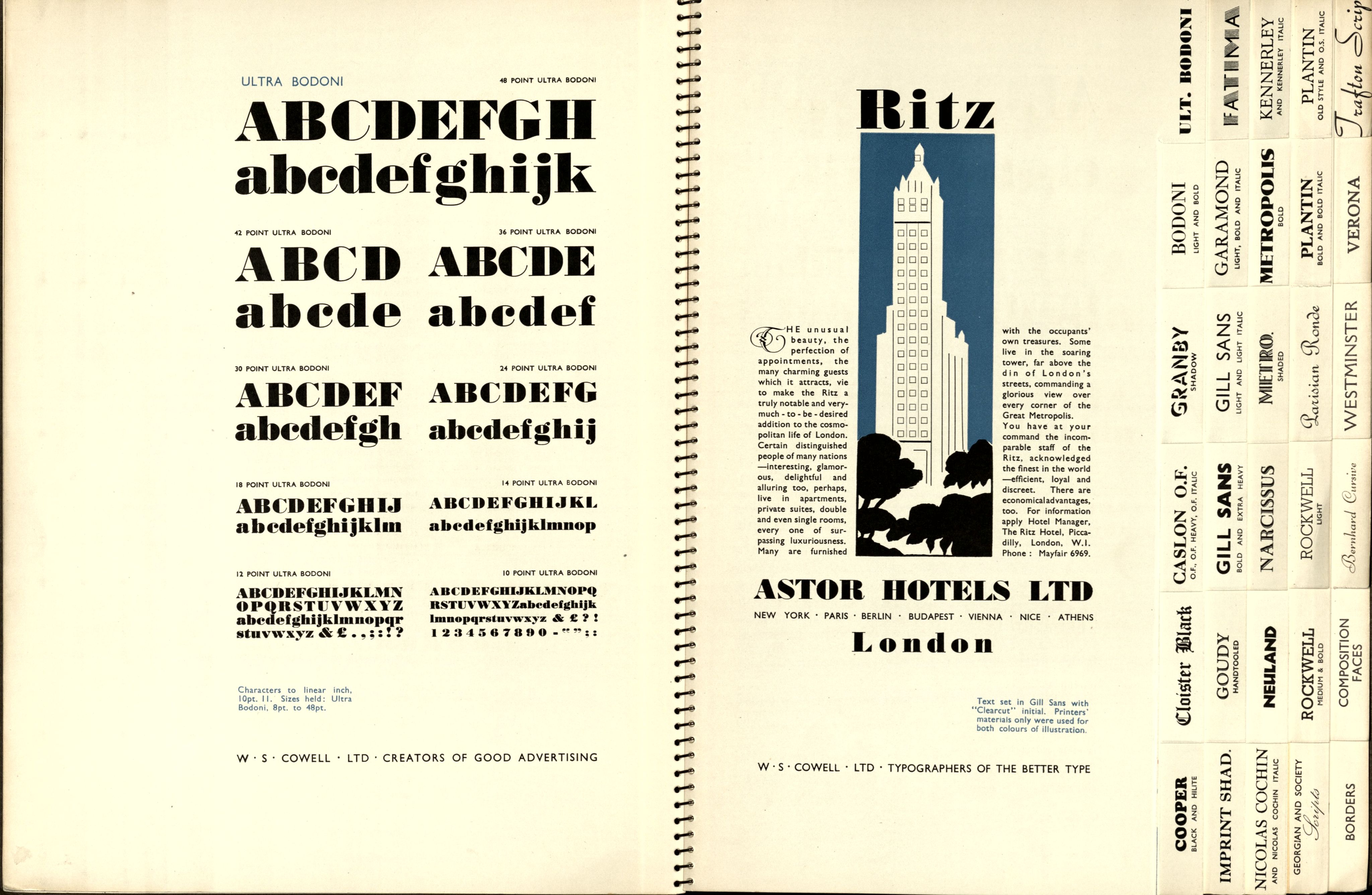
A page from "A Book of Typefaces: With some illustrated examples of text and display setting". This book contains example of fonts and their possible applications, 1954, (HC439/A/E/5/3).
A page from "A Book of Typefaces: With some illustrated examples of text and display setting". This book contains example of fonts and their possible applications, 1954, (HC439/A/E/5/3).

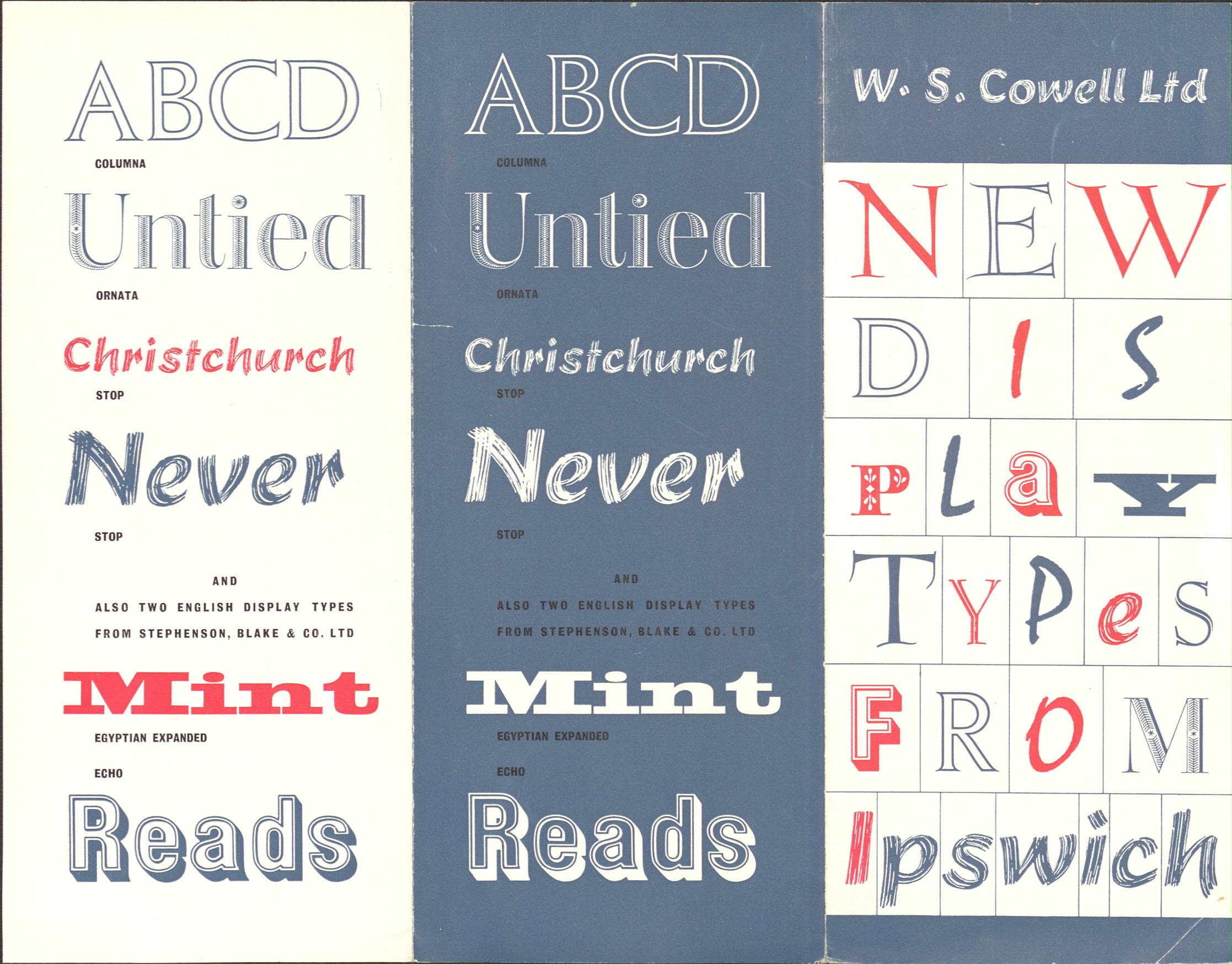
A leaflet advertising new display types, or fonts available from W.S. Cowell, (HC439/A/E/3/9).
A leaflet advertising new display types, or fonts available from W.S. Cowell, (HC439/A/E/3/9).

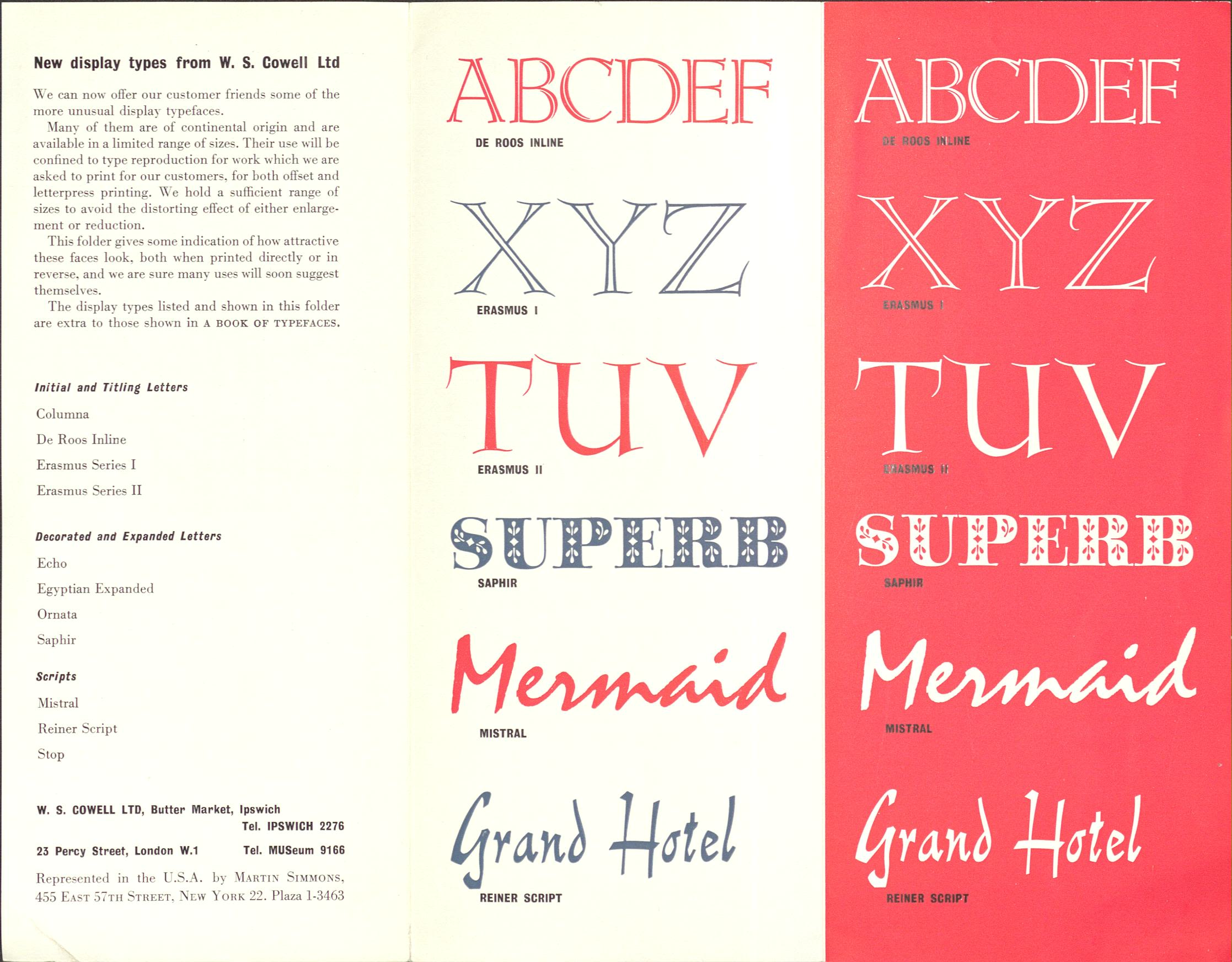
A leaflet advertising new display types, or fonts available from W.S. Cowell, (HC439/A/E/3/9).
A leaflet advertising new display types, or fonts available from W.S. Cowell, (HC439/A/E/3/9).

Two designs of calling cards produced by W.S Cowell (HC439/A/E/3/9).
Two designs of calling cards produced by W.S Cowell (HC439/A/E/3/9).
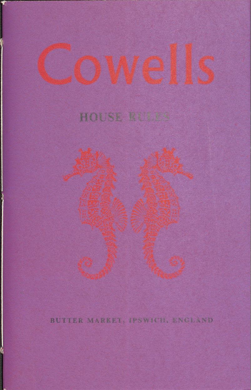
Calling cards, House Rules, Blotter Cards, and promoting Careers. And the 12 days of Christmas..?
Also, during this time, W.S Cowell produced a variety of calling cards; documents, dubbed "House Rules", setting out the requirements and rules of printing to ensure consistency and quality; blotter cards and leaflets promoting careers in printing for young people (HC439/A/E/3/9). Examples of these are shown below.

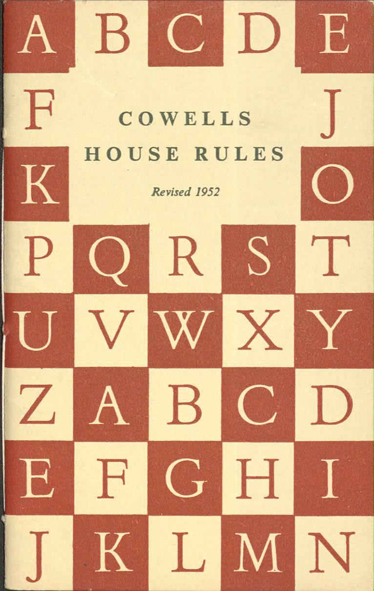
Cowells House Rules, (HC439/A/E/3/9).
Cowells House Rules, (HC439/A/E/3/9).

Cowells House Rules, (HC439/A/E/3/9).
Cowells House Rules, (HC439/A/E/3/9).

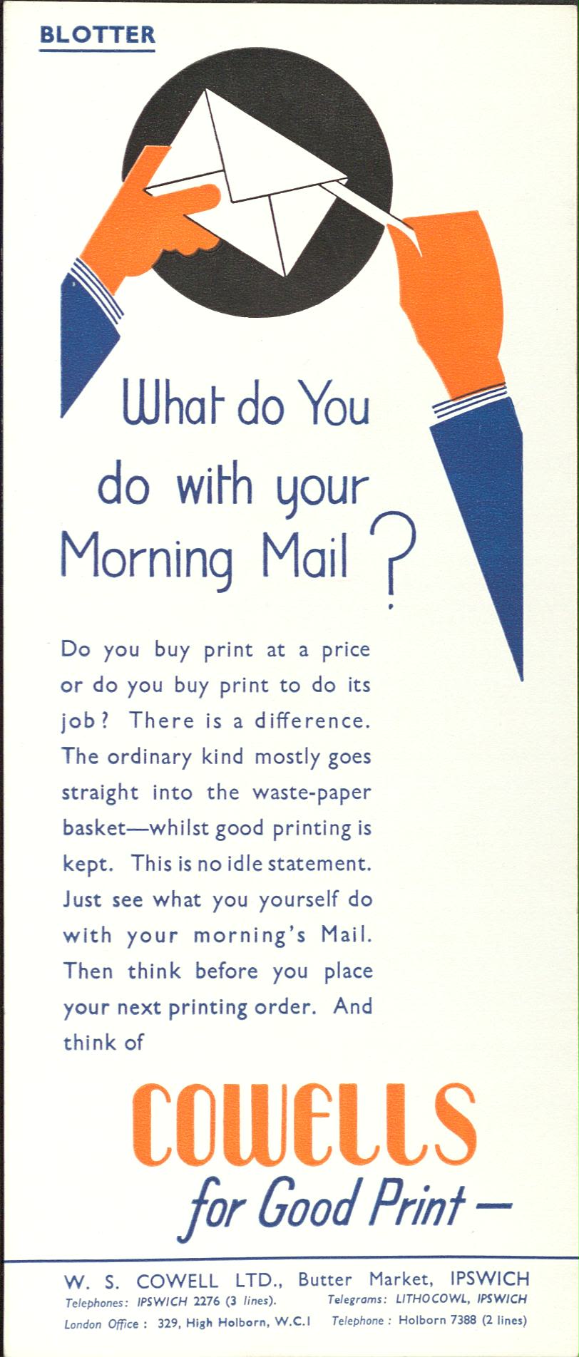
Blotter card, (HC439/A/E/3/9)
Blotter card, (HC439/A/E/3/9)

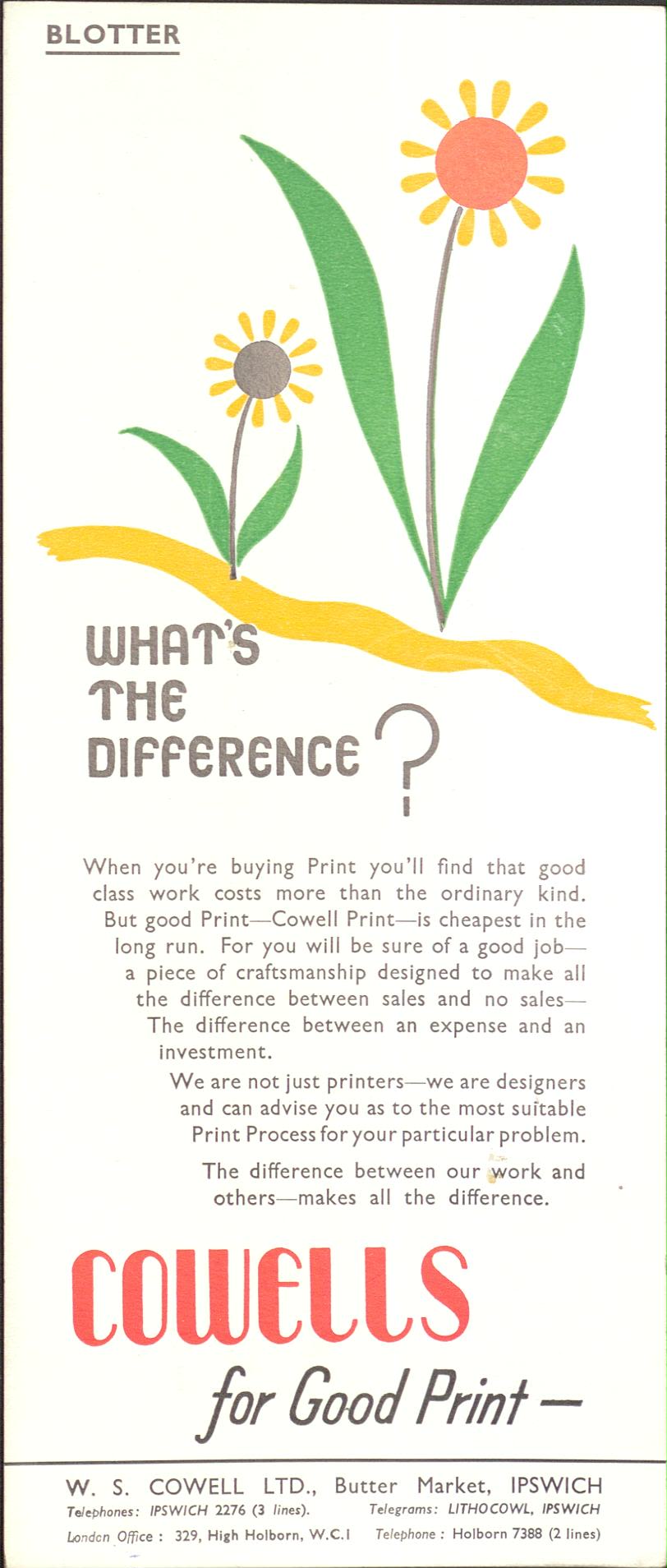
Blotter card, (HC439/A/E/3/9)
Blotter card, (HC439/A/E/3/9)

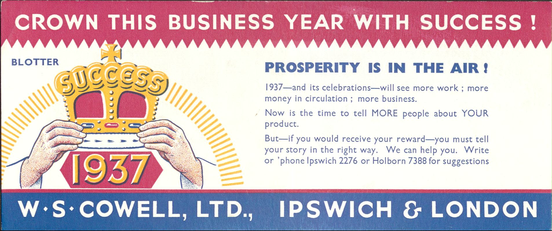
Blotter card, (HC439/A/E/3/9)
Blotter card, (HC439/A/E/3/9)


Heading
Writing is a medium of communication that represents language through the inscription of signs and symbols.
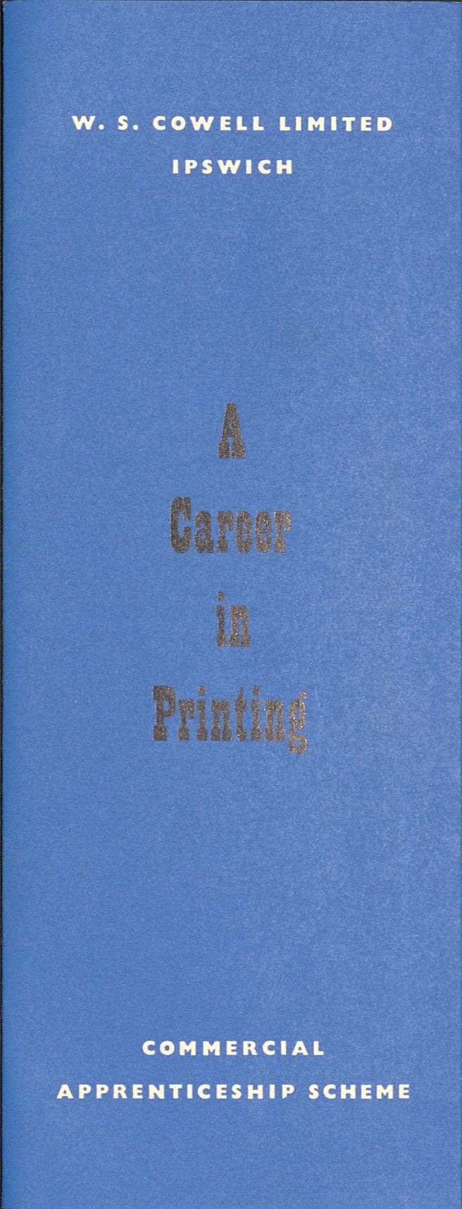
A career in printing, (HC439/A/E/3/9).
A career in printing, (HC439/A/E/3/9).
Careers in printing.
A fold out, stylistic representation of the 12 days of Christmas song was also created sometime between 1966 to 1969 (HC439/A/E/4/26).

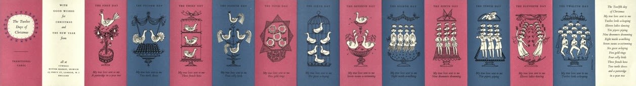
12 days of Christmas (HC39/A/E/3/9).
12 days of Christmas (HC39/A/E/3/9).
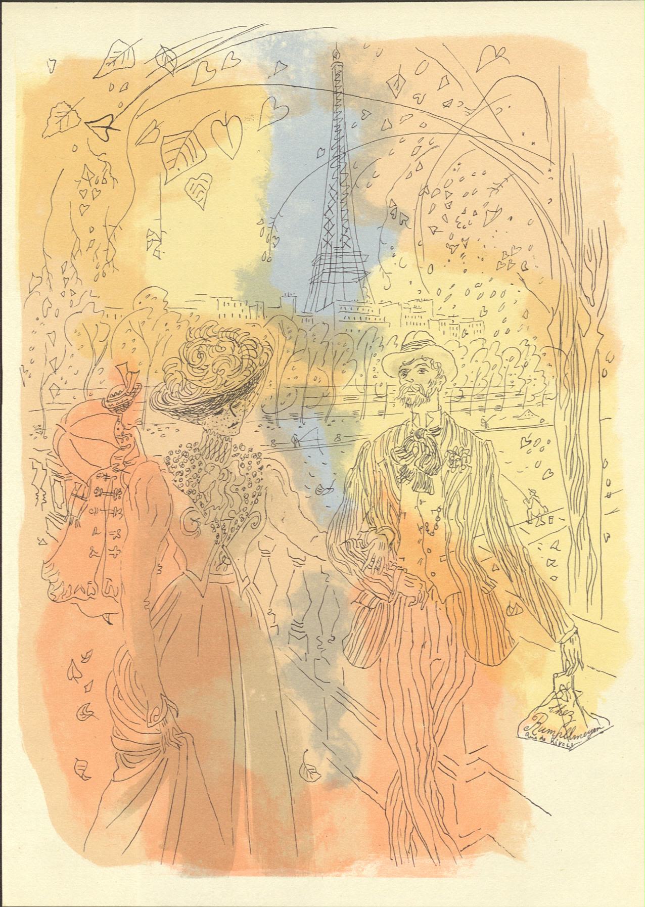
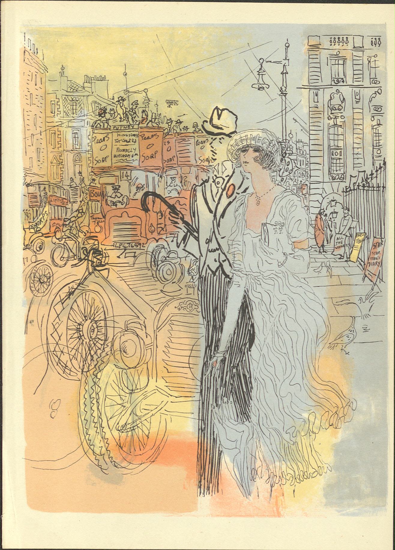
Special Editions
The mission of publishers such as The Folio Society, (est. 1947), and The Limited Editions Club, (est. 1929), was to publish “exquisite editions for book lovers”.
These publishers aimed to republish classic book titles with new designs and illustrations contemporary artists. The books produced were of the highest quality in every aspect of design and printing. W. S. Cowell had established such a good reputation that they were trusted to be one of only a handful of printers capable of delivering such quality.

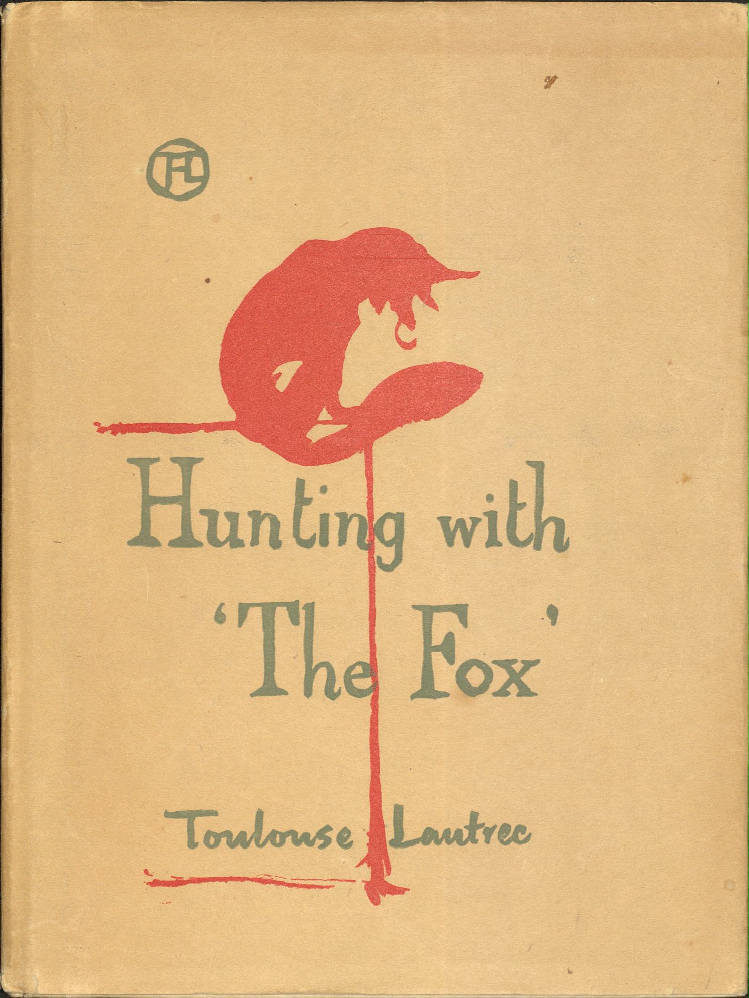
"Hunting With the Fox" by Toulouse-Lautrec. 1948.

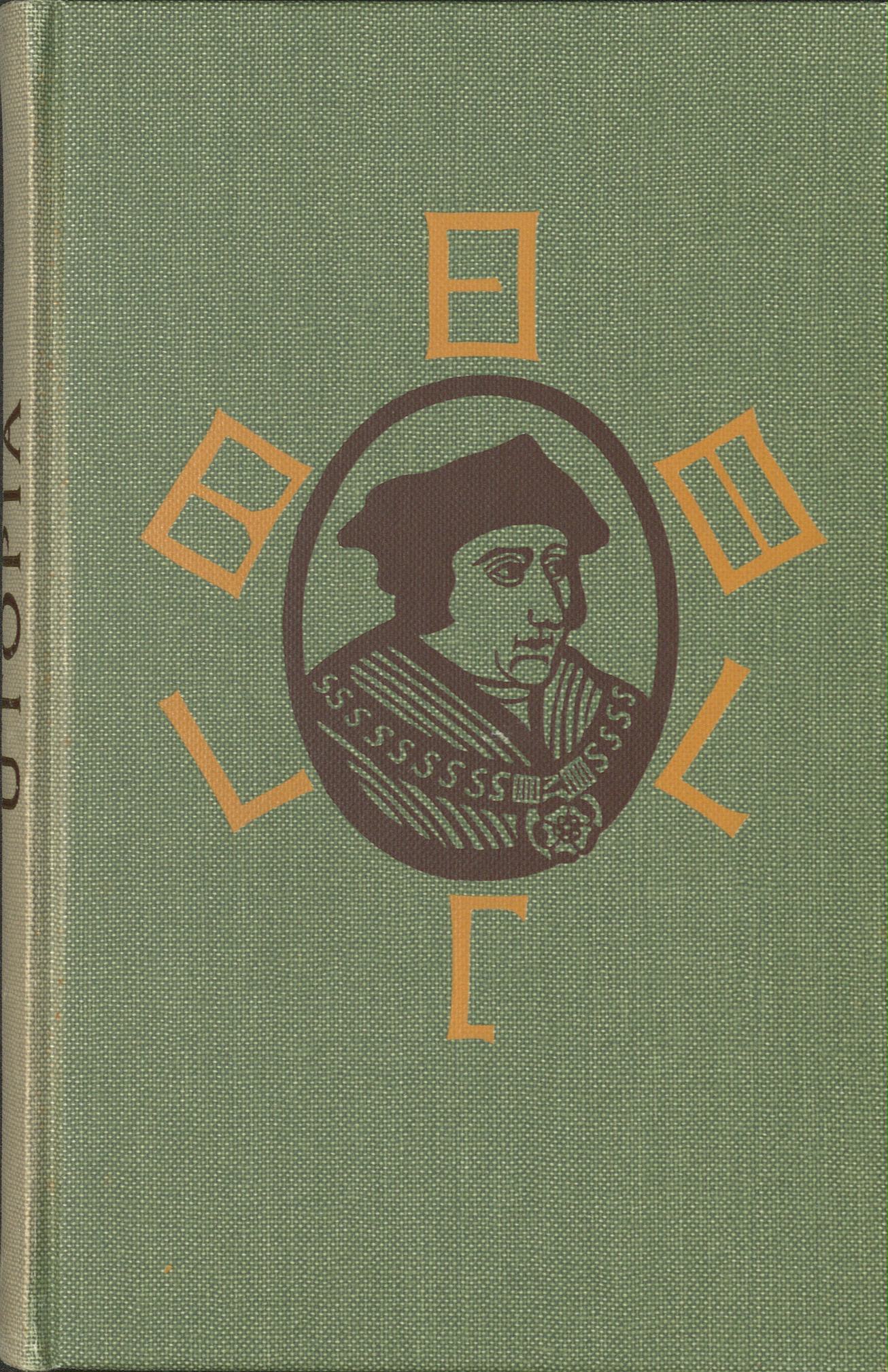
"Utopia" by Thomas More, illustrated by Edward Bawden. 1972. The Folio Society.

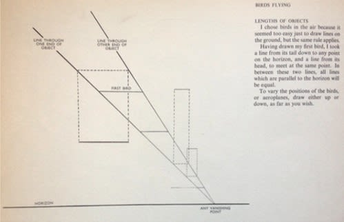
"A book of Pictorial Perspectives" by Gwen White. Each concept has an illustration (see right) and an diagram (shown here).
"A book of Pictorial Perspectives" by Gwen White. Each concept has an illustration (see right) and an diagram (shown here).

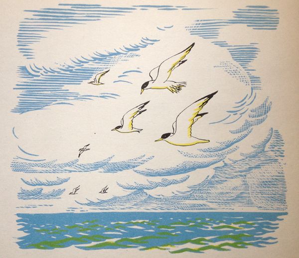
"A book of Pictorial Perspectives" by Gwen White. Each concept has an illustration (shown here) and an diagram (to left).
"A book of Pictorial Perspectives" by Gwen White. Each concept has an illustration (shown here) and an diagram (to left).

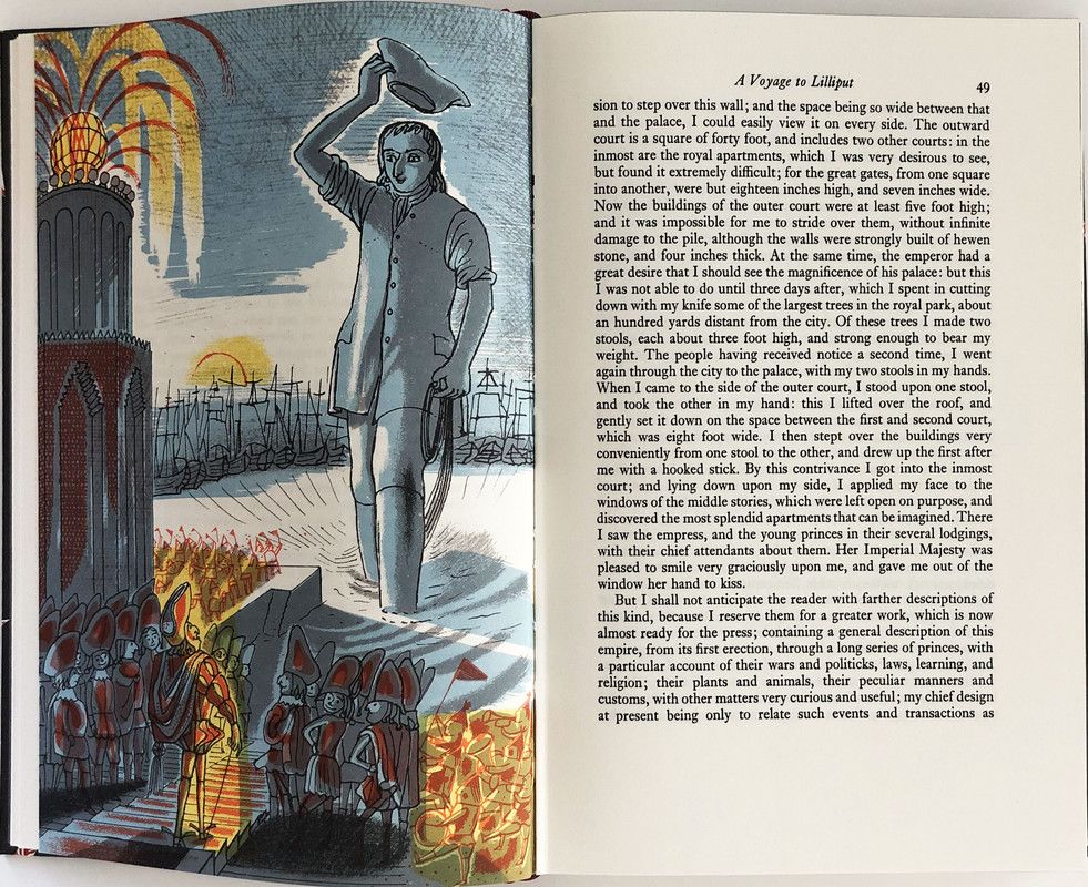
An inside page of "Gulliver's Travels" by Jonathon Swift, 1966.
An inside page of "Gulliver's Travels" by Jonathon Swift, 1966.

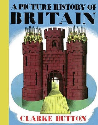
The cover of "A Picture History of Britain" by Clarke Hutton, 1946.
The cover of "A Picture History of Britain" by Clarke Hutton, 1946.
David Gentleman
David Gentleman is a very successful graphic designer and illustrator. He spent time living in Suffolk, and later when living in London has continued to visit and work in the area.
In the 1960s he was commissioned by the Limited Editions Club to illustrate a series of high quality classic books which were printed by W.S. Cowell.
For three of the books that W.S. Cowell printed, Gentleman used pen and ink drawings and watercolour painted on to plasticowell sheets. Swiss Family Robinson is the exception.

An illustration from the "Jungle book", 1968.
An illustration from the "Jungle book", 1968.

An illustration from the "Jungle book", 1968.
An illustration from the "Jungle book", 1968.
Swiss family robinison
Gentleman illustrated the 1963 edition of the Swiss Family Robinson using wood-engravings.

An illustration from "Swiss Family Robinson", 1963.
An illustration from "Swiss Family Robinson", 1963.

An illustration from "Swiss Family Robinson", 1963.
An illustration from "Swiss Family Robinson", 1963.
The Poems of John Keats
His illustrations for The Poems of John Keats in 1966 required seven colour separations.

An illustration from "The Poems of John Keats", 1966.
An illustration from "The Poems of John Keats", 1966.

An illustration from "The Poems of John Keats", 1966.
An illustration from "The Poems of John Keats", 1966.
Art Education
In the 1960s John Lewis set up the W.S. Cowell design department, and later started another job teaching graphic design at the Royal College of Art in London. He kept up his links with W.S. Cowell and contracted the company to print the popular Royal College of Art journal Ark.

A picture from Ark Magazine, 15.
A picture from Ark Magazine, 15.

A picture from ark magazine 16
A picture from ark magazine 16
Chalk Magazines
In 1970 Lewis started a project working with other art colleges in the UK to give students the opportunity to illustrate the neighbourhood of their college, and publish the work in a magazine. The magazine was called Chalk and the first edition was published in 1971. W.S. Cowell printed the magazine using plasticowell but in the end only four editions were made despite being popular as a showcase of student talent.
Front pages and a few examples pages of "Chalk" Magazines 1 to 4 are shown in this video, (HC439/A/E/4/24)
Front pages and a few examples pages of "Chalk" Magazines 1 to 4 are shown in this video, (HC439/A/E/4/24)
During this time, W.S Cowell also worked in partnership with Ipswich School students to create two book showcasing their art work.

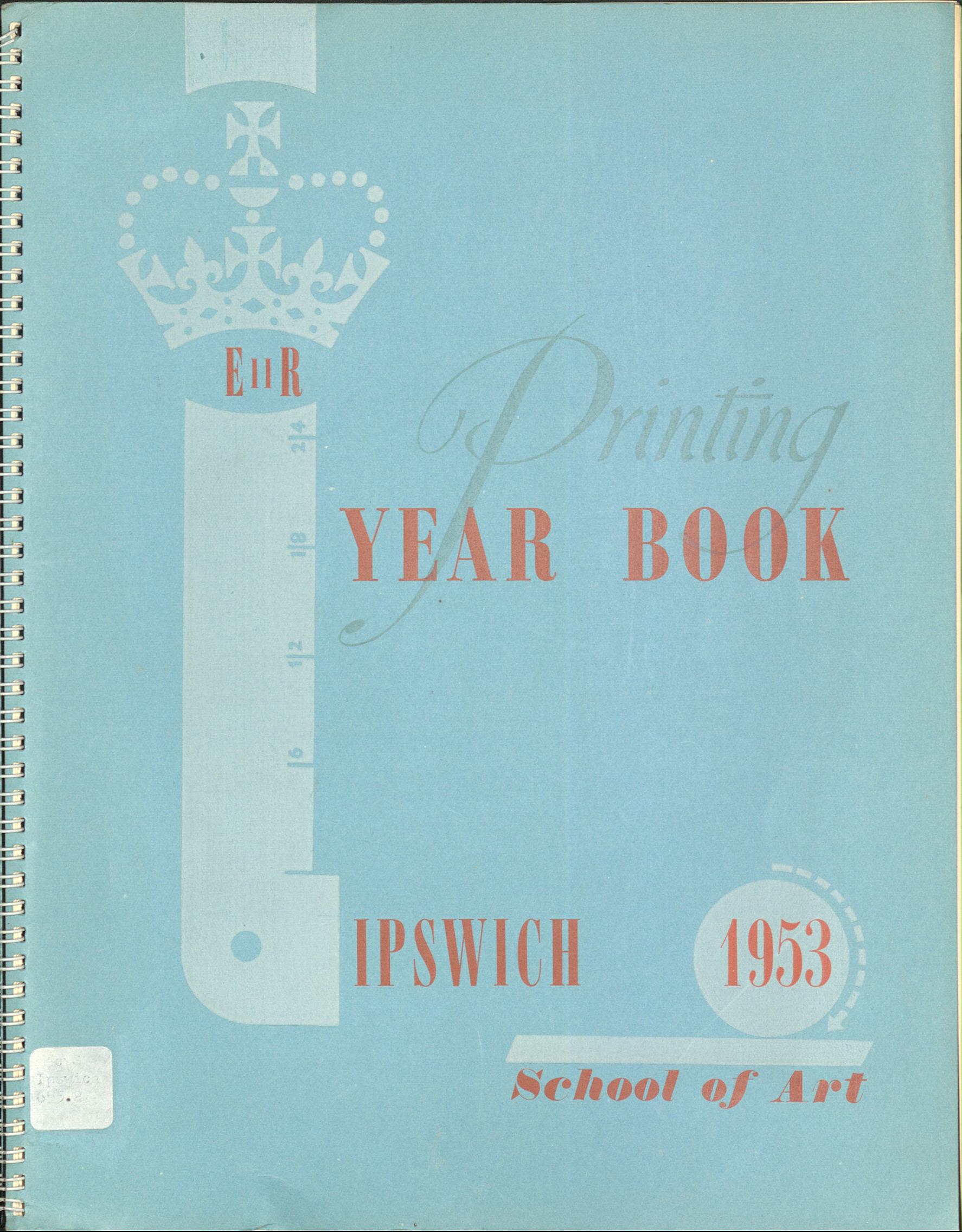
"Printing Year Book for Ipswich School of Art", 1953, (686.22).
"Printing Year Book for Ipswich School of Art", 1953, (686.22).

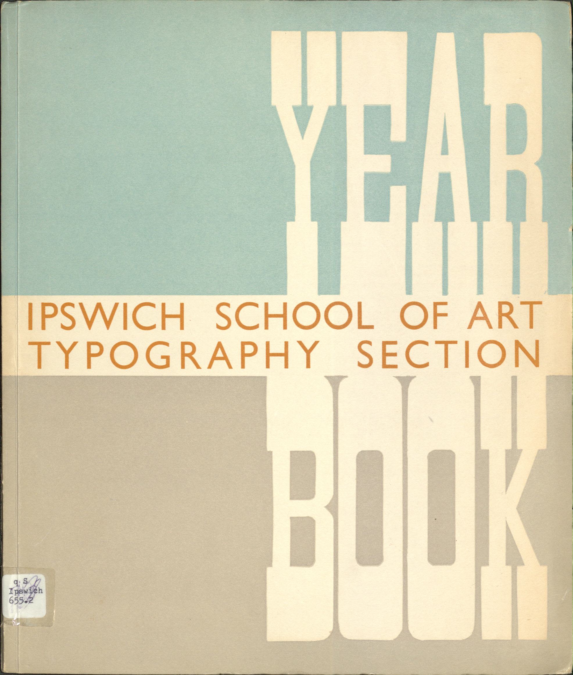
The front cover of a book entitled "Ipswich School of Art Typography Section", 1950, (686.22)
The front cover of a book entitled "Ipswich School of Art Typography Section", 1950, (686.22)

Promotional notebook celebrating the 150th anniversary of W.S. Cowell, (HC439/A/A/5/14).
Promotional notebook celebrating the 150th anniversary of W.S. Cowell, (HC439/A/A/5/14).
The End of an Era...
The picture books produced by W.S. Cowell inspired illustrators, publishers and printers. By the 1960s picture books had become a celebrated artform.
At the start of the 1970s Geoffrey Smith and Eric Hanson both retired from W. S. Cowell, and this marked the start of a decrease in the company’s work. With no one to step in who combined ambition and business skills, W.S. Cowell was unable to compete with the technological advances and competition of the international printing market. W.S. Cowell finally closed its doors in 1988.
The Picture Books Today
Heading
Writing is a medium of communication that represents language through the inscription of signs and symbols.
New technologies such as offset lithography (where the image is transferred to a middle surface before printing, rather than directly from plate to paper) and digital printing provided new options for printing picture books.
Digital design software and instant communication now allows publishers to work with authors, illustrators and printed across the world. Artwork can be produced accurately in less time and at a much lower cost than in the past.
However, around 2012 people were concerned that eBooks could make printed books outdated. Since then, publishers have focused on producing high-quality printed books and have taken advantage of the many choices in paper stock, special finishes and typography now available. As a result, nonfiction picture books are once again a big part of children’s publishing with more beautiful and inventive books than ever before.
Many artists still refer to the continuity in design that the Puffin Picture Books brought to nonfiction, and short series of titles continue to be a popular approach.
In the future the printing industry will be looking at sustainable production in terms of materials and energy. We wait and see how these issues will be tackled by illustrators, printers, and publishers.

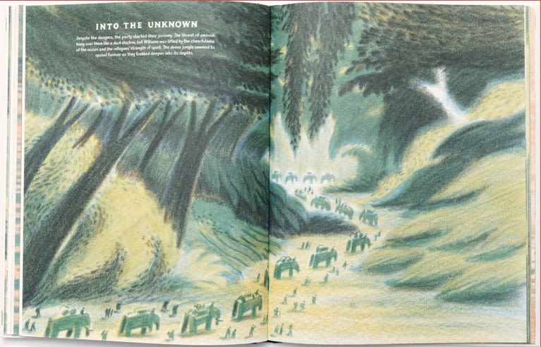
An inside page of "Bandoola: The Great Elephant Rescue" by William Grill. 2021. Reproduced by kind permission of Flying Eye Books LtdText and Illustrations from Bandoola © William Grill 2021.
An inside page of "Bandoola: The Great Elephant Rescue" by William Grill. 2021. Reproduced by kind permission of Flying Eye Books LtdText and Illustrations from Bandoola © William Grill 2021.
Bandoola: The Great Elephant Rescue by William Grill. 2021. Flying Eye Books/Nobrow Inc.
William Grill’s work starts with black and white hand drawn layers, which are then coloured digitally with a single colour per layer and layered up to create the full colour images as can be seen in the book. This mimics traditional printing processes.

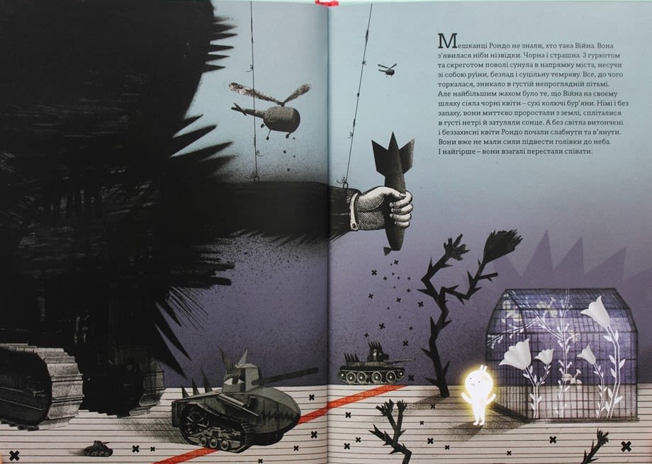
An inside page of "How War Changed Rondo". Material/images used with permission from Enchanted Lion Books.
An inside page of "How War Changed Rondo". Material/images used with permission from Enchanted Lion Books.
How War Changed Rondo by Romana Romanyshyn and Andriy Lesiv. 2015, English translation 2021. Enchanted Lion Books.
The ability to create artwork digitally allows artists to combine photographs, prints, drawings and text in new ways. Children’s book artists continue to push boundaries combining factual information with fictional stories to help young readers to understand challenging topics or situations.

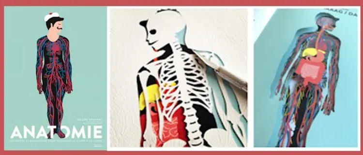
The front cover and an inside page of "Anatomy" by Hélène Druvert. 2016.
The front cover and an inside page of "Anatomy" by Hélène Druvert. 2016.
Anatomy by Hélène Druvert. 2016. Thames and Hudson.
Hélène Druvert’s book using cutaways and flaps to engage the reader. Shapes are cut into the page with great precision giving the reader a partial view of the page behind, and to convey the idea of layers.

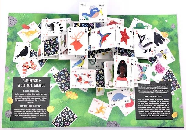
An inside page of "Pop-up Earth".
An inside page of "Pop-up Earth".
Pop-up Earth by Anne Jankeliowitch, Oliver Charbonnel, Annabelle Buxton. 2021 translated into English. Thames and Hudson.
In this book paper engineering is used to create pop-up and moveable features. Laser cut illustrated shapes are folded and glued to make 3D structures that pop out of the book when pages are turned. This process is very involved and requires creativity and imagination.
Acknowledgements
Picture Books for all is funded and supported by the National Lottery Heritage Fund, the University of Suffolk, and Suffolk County Council.
Thank you to all who have supported the development of the exhibition, included but not limited to:
Co-Curators from the University of Suffolk: Nigel Ball, Rob Ramsden, Dr Vassiliki Tzomaka.
Design for Today - Joe Pearson.
Thank you to the organisations and publishers who donated books.
The curators would like to thank Ruth Artmonsky and her book Do You Want It Good or Do You Want It Tuesday for inspiring this exhibition.
Disclaimer: Every effort has been made to contact the appropriate copyright holders for works included, but this is not always possible. For any enquiries please contact archives@suffolk.gov.uk
